Sullivan & Lambe
Strategy / Naming / Identity / Print / Art Direction
Redefining craftsmanship for a modern era.
-
Formerly known as Granite Tops, the business had outgrown an identity that no longer reflected its scale, expertise or ambition. The brand needed to communicate precision, craftsmanship and a more design-led approach, while repositioning the company for a premium, contemporary market.
-
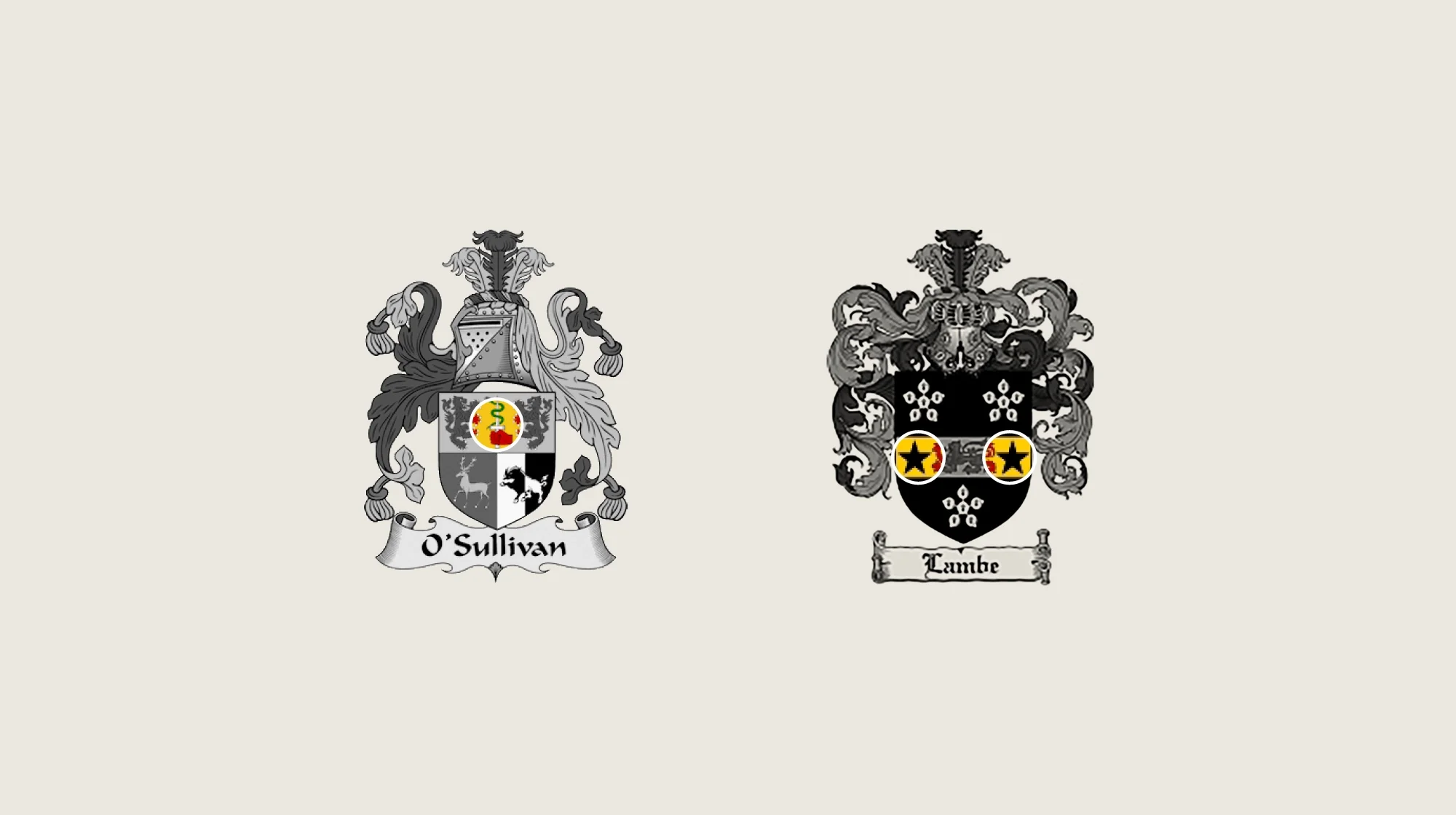
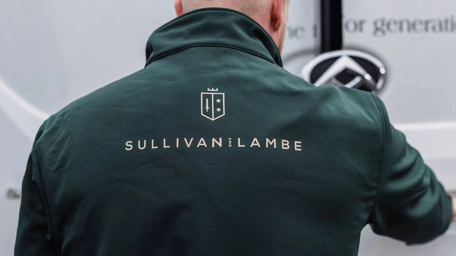
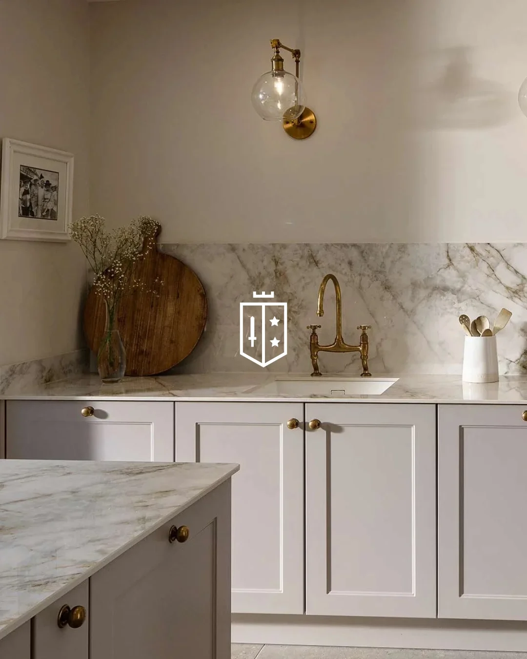
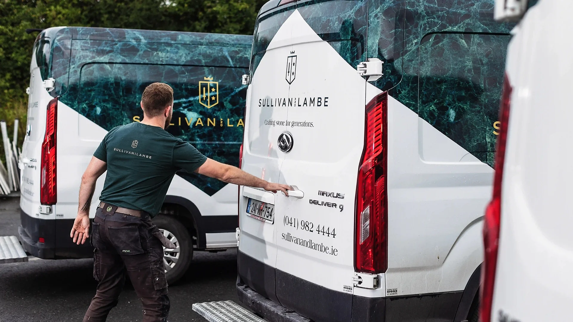
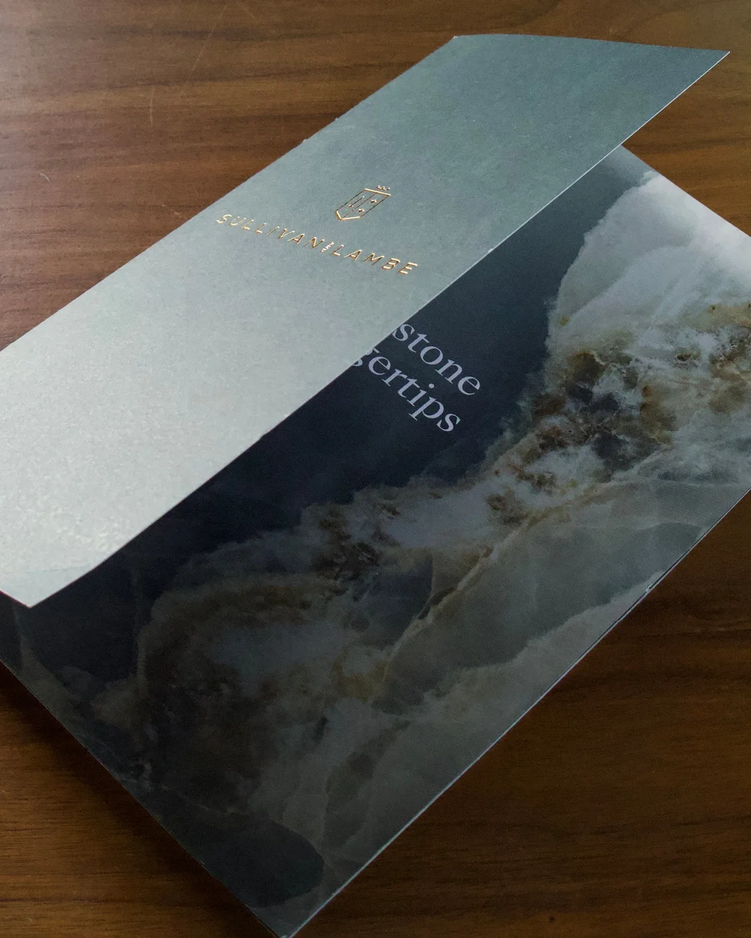
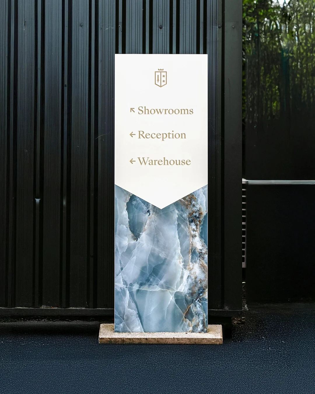
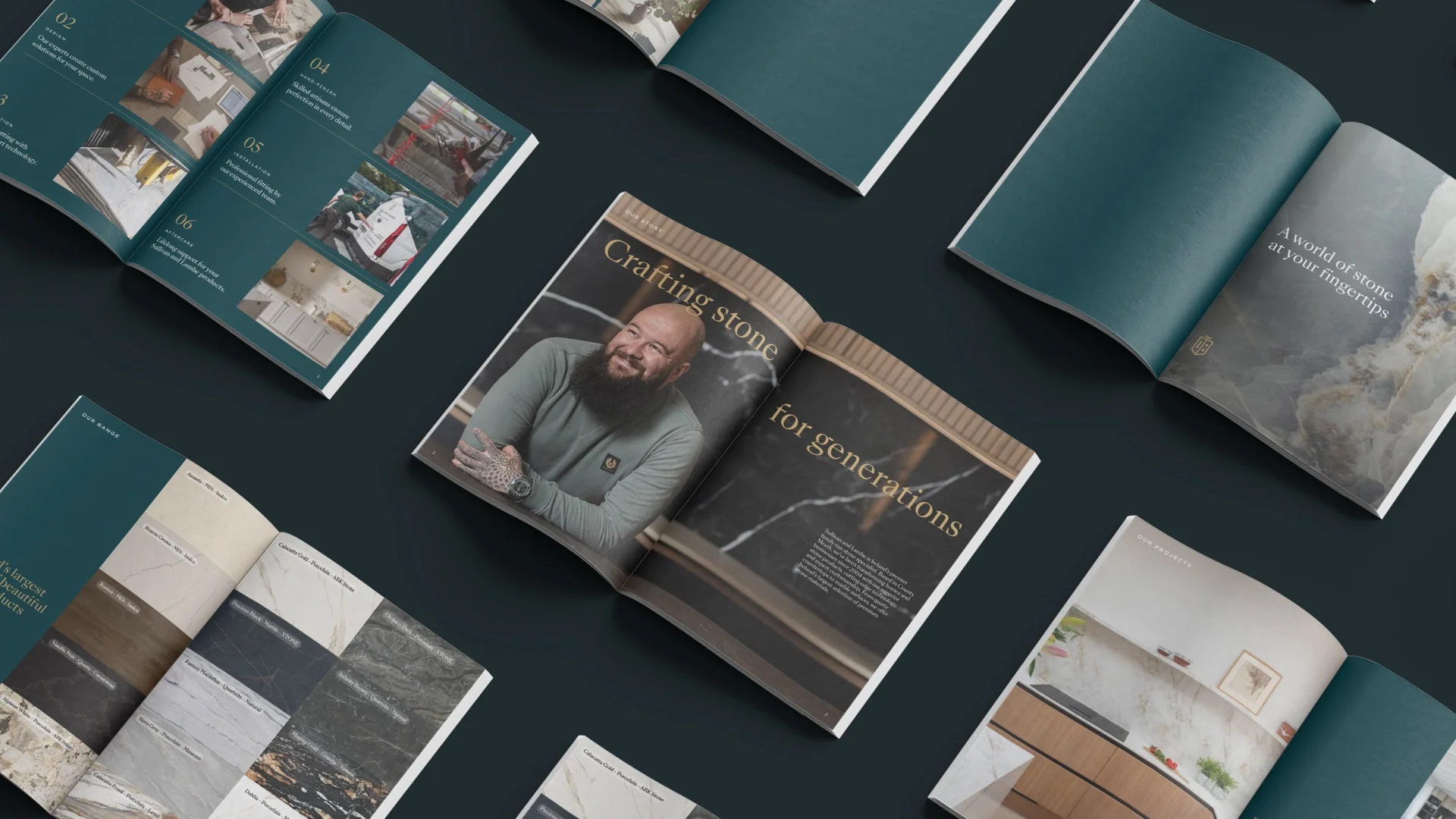
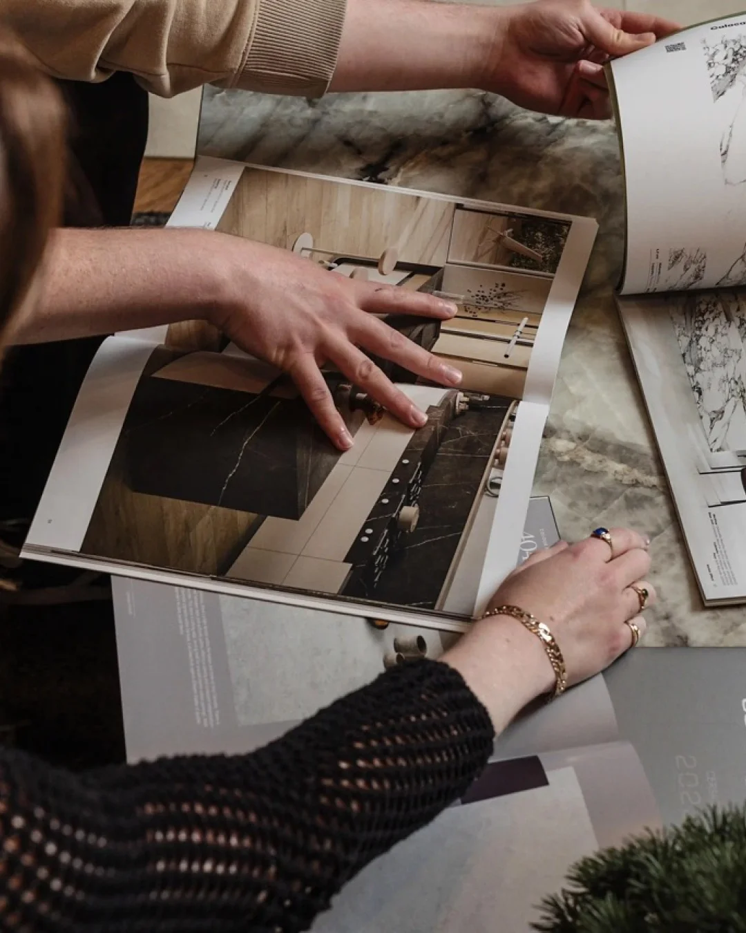
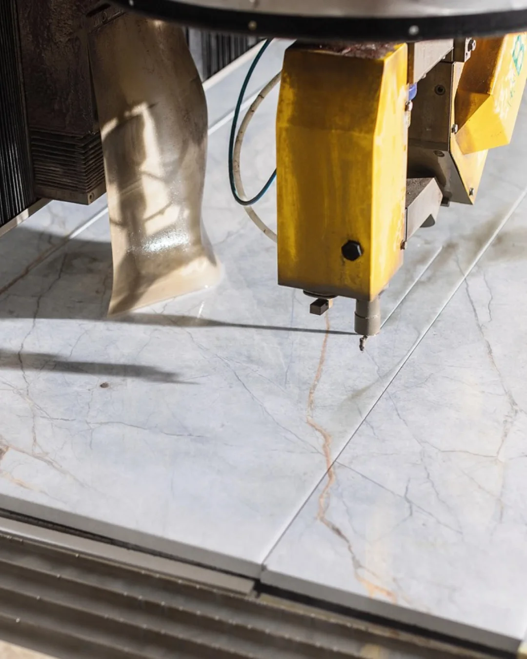
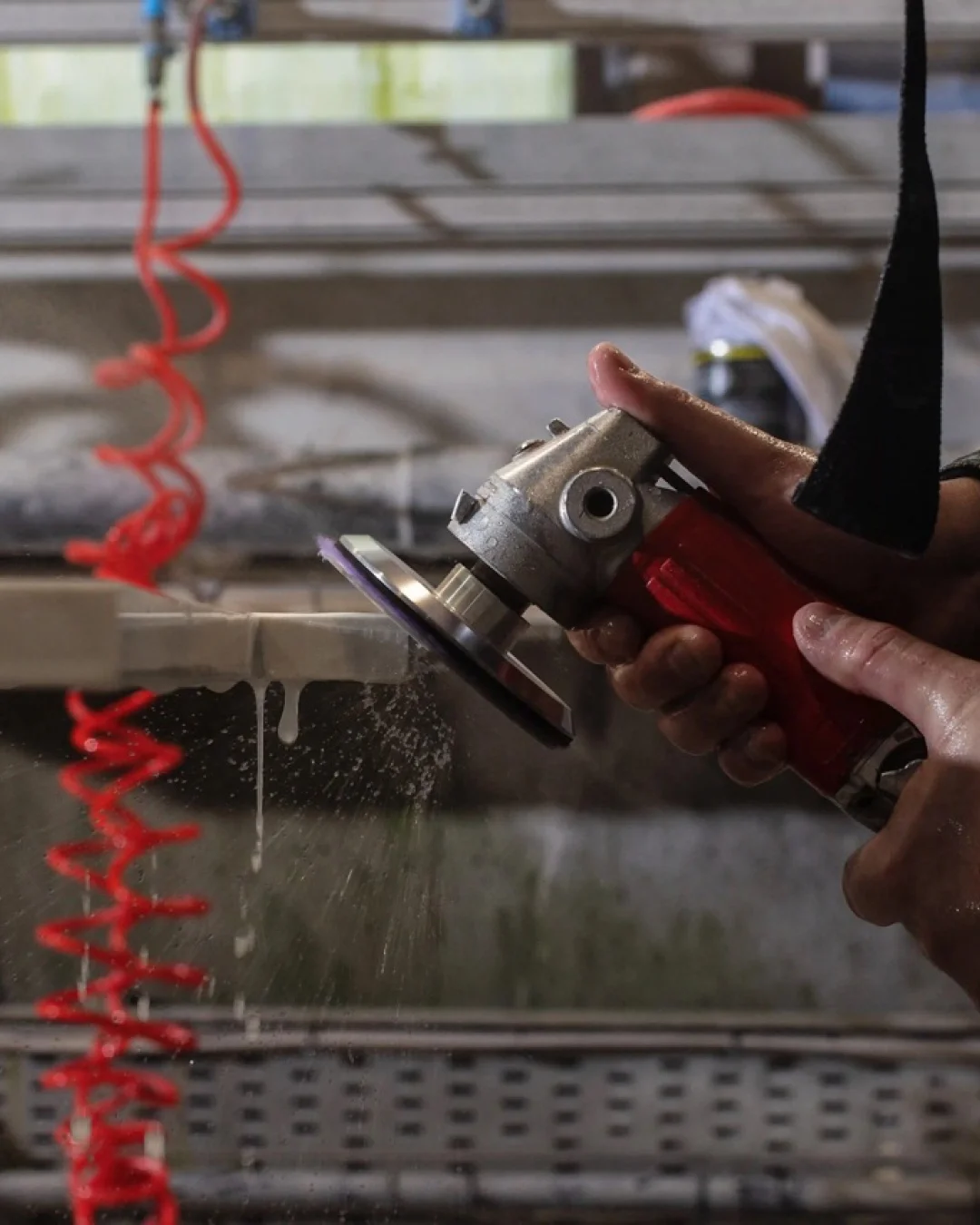
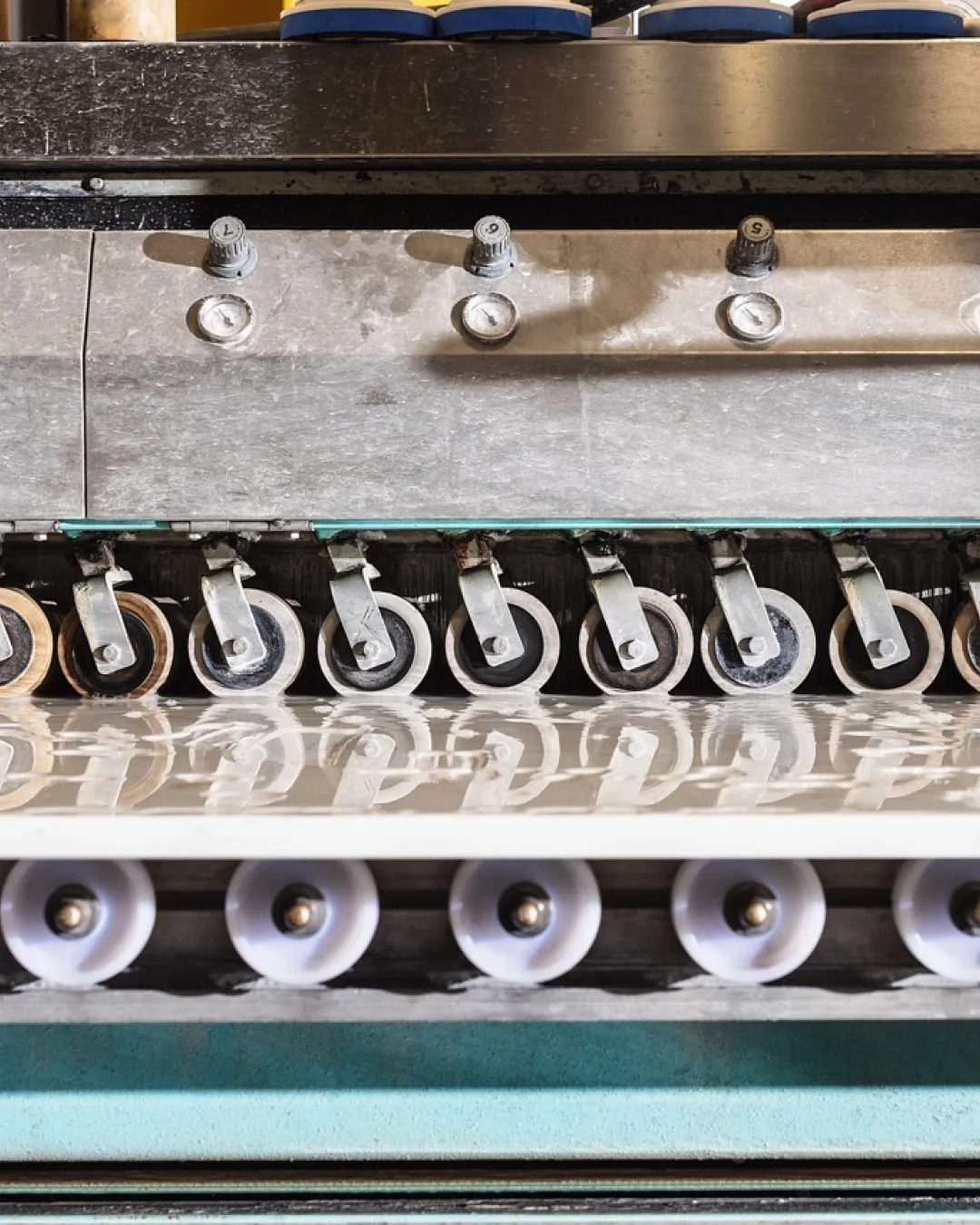
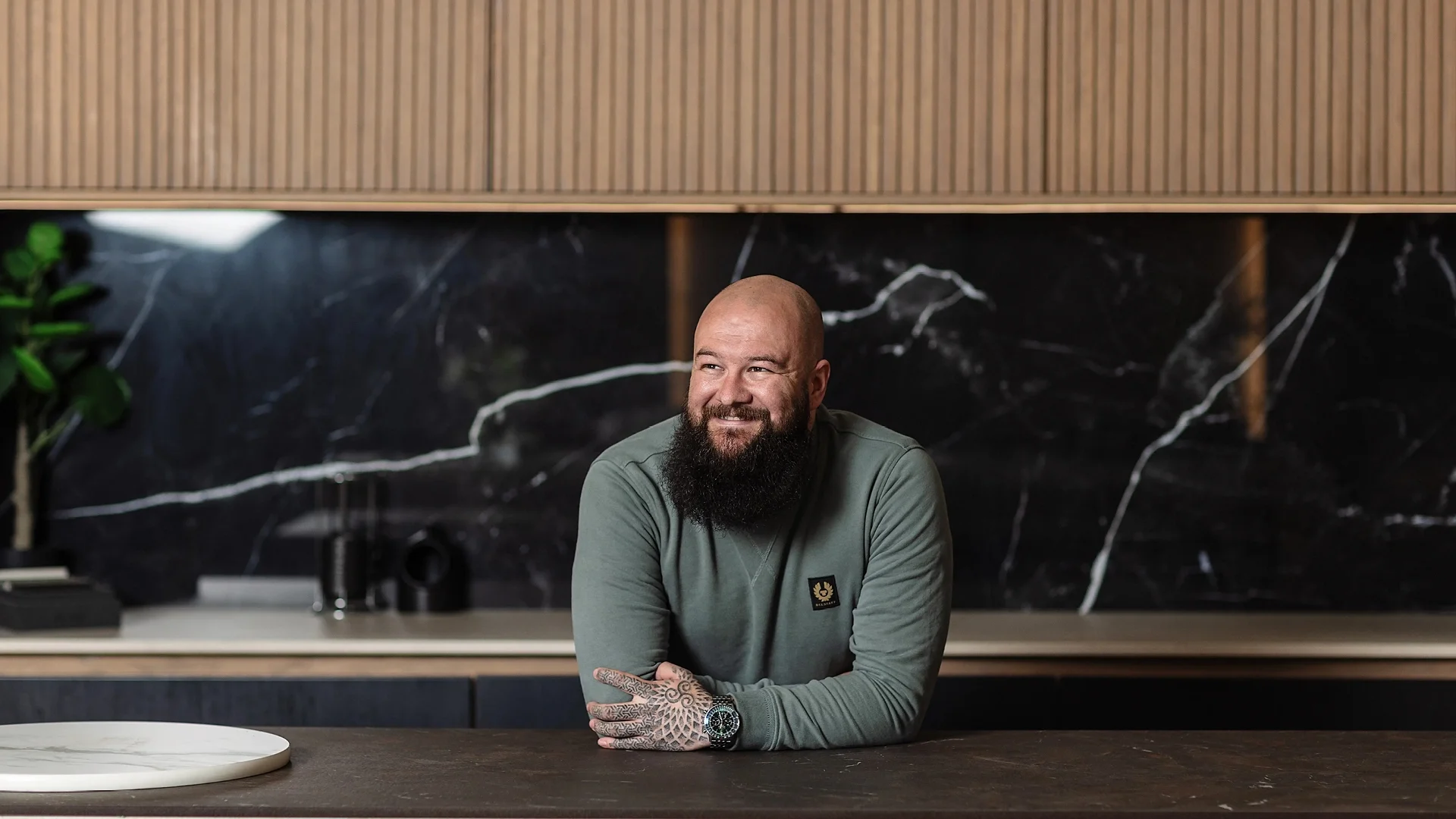
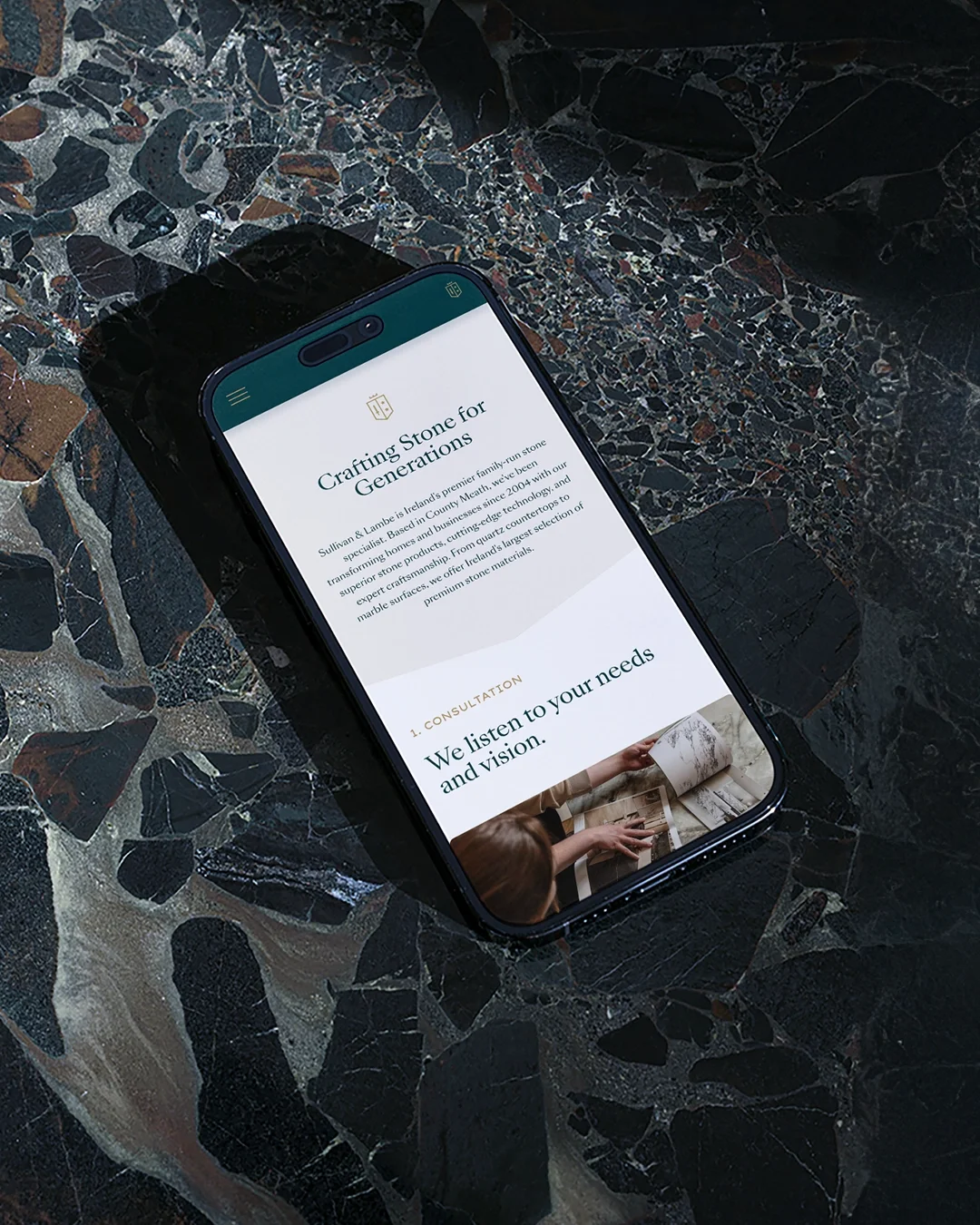
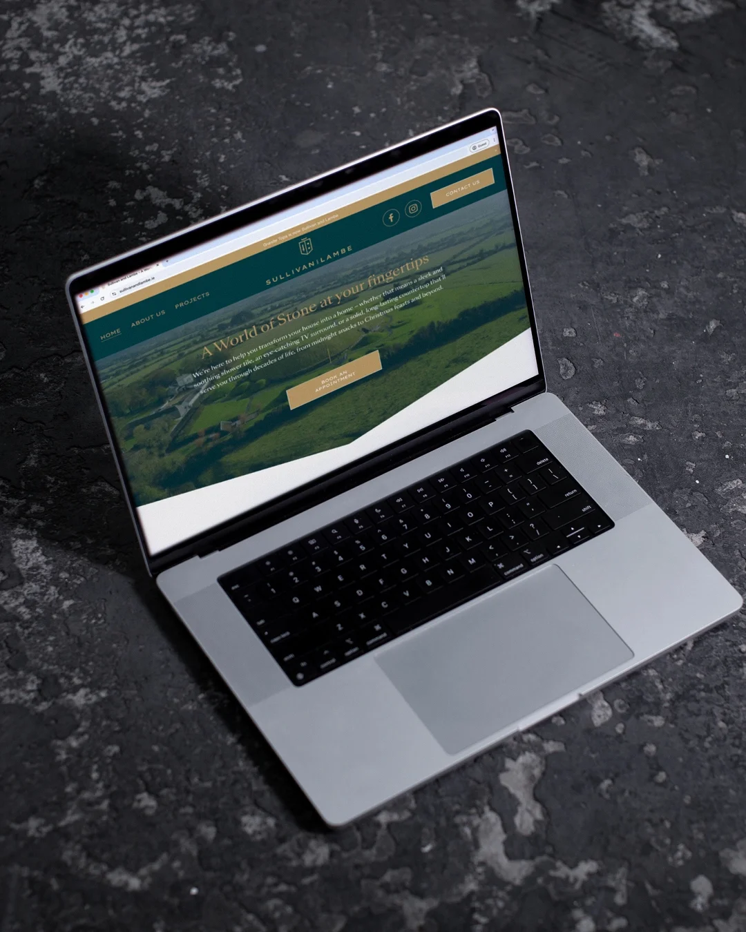
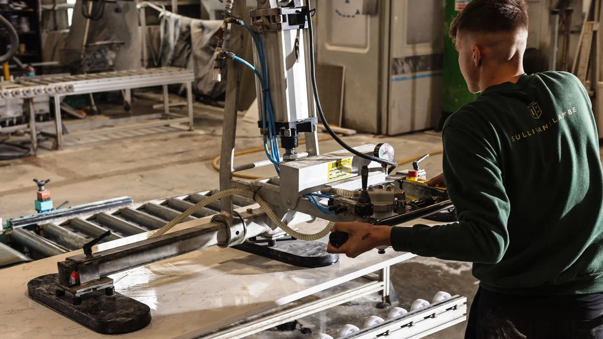
Following the introduction of the new name, Sullivan & Lambe, a refined brand identity system was developed to express heritage, quality and modern craftsmanship. A crest-style mark drew on elements of the O’Sullivan and Lambe family crests, grounding the identity in provenance. Textures captured from the company’s large-format stone scanner were incorporated throughout the system, alongside considered typography, tactile materials and a restrained colour palette. Photography was art directed to reinforce clarity, craft and attention to detail across brand touchpoints.
Project Type: Rebrand
Role: Senior Designer
Agency: BrandNew Creative
Photography: Al Higgins