Brand Design Portfolio
Hi Koto
I’m Ailbhe (Al-va) Diskin.
I’m a senior designer who loves yapping, problem-solving, and beautiful things. I create brand systems and experiences that are clear, confident, and considered, bridging strategy and design, leading projects from concept to delivery, and shaping work that’s adaptable and impactful.
hello@ailbhediskin.com
+353 85 117 5436
-
Independent Designer (Self-employed)
July 2025 - PresentSenior Designer (BrandNew Creative)
May 2023 - July 2025Mid-Weight Designer (Neworld)
December 2020 - May 2023Junior Designer (Neworld)
October 2018 - December 2020Design Intern (Neworld)
July 2018 - October 2018 -
BA Design - Visual Communication (TU Dublin)
2014 - 2018
First Class Honours
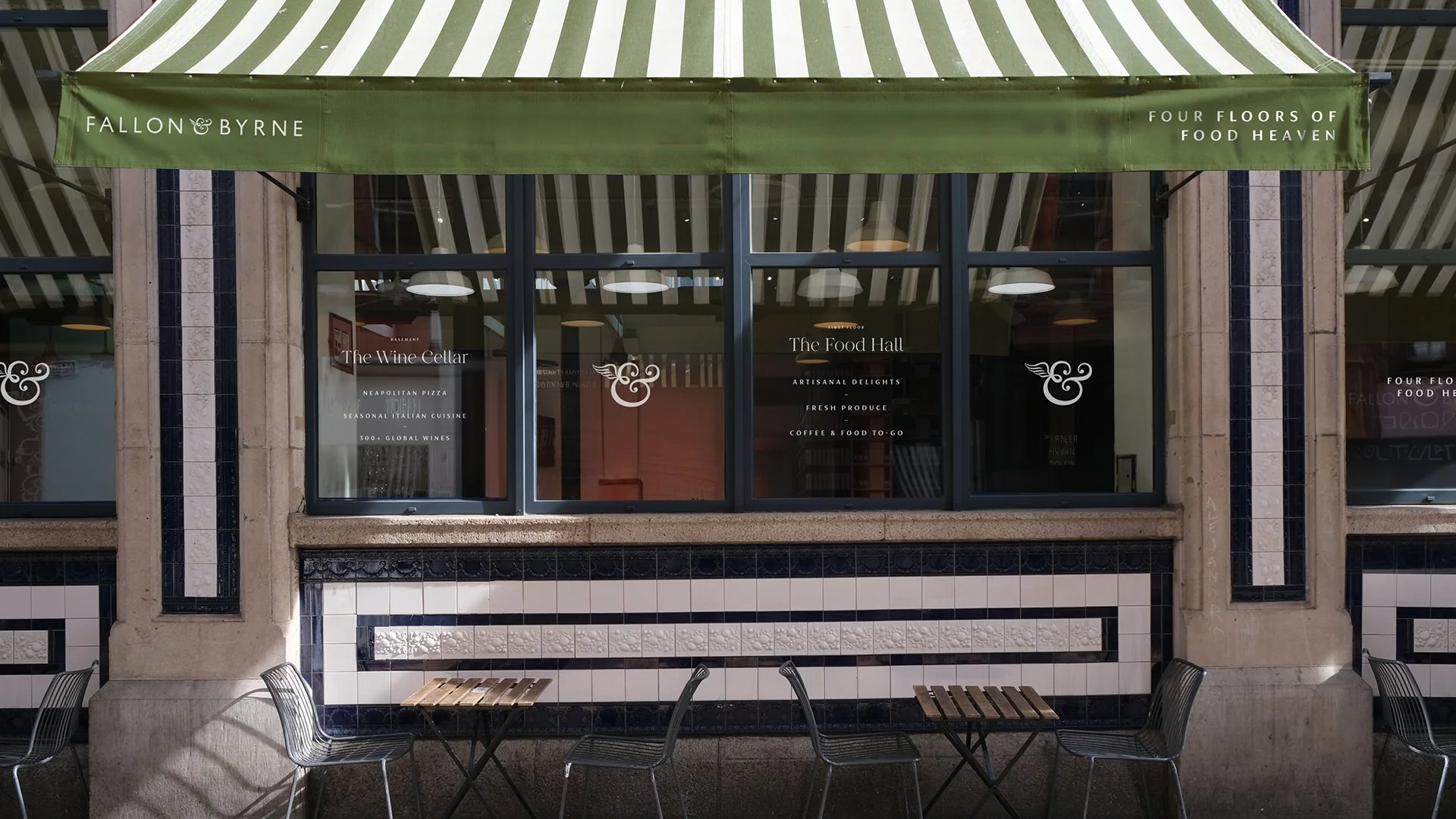
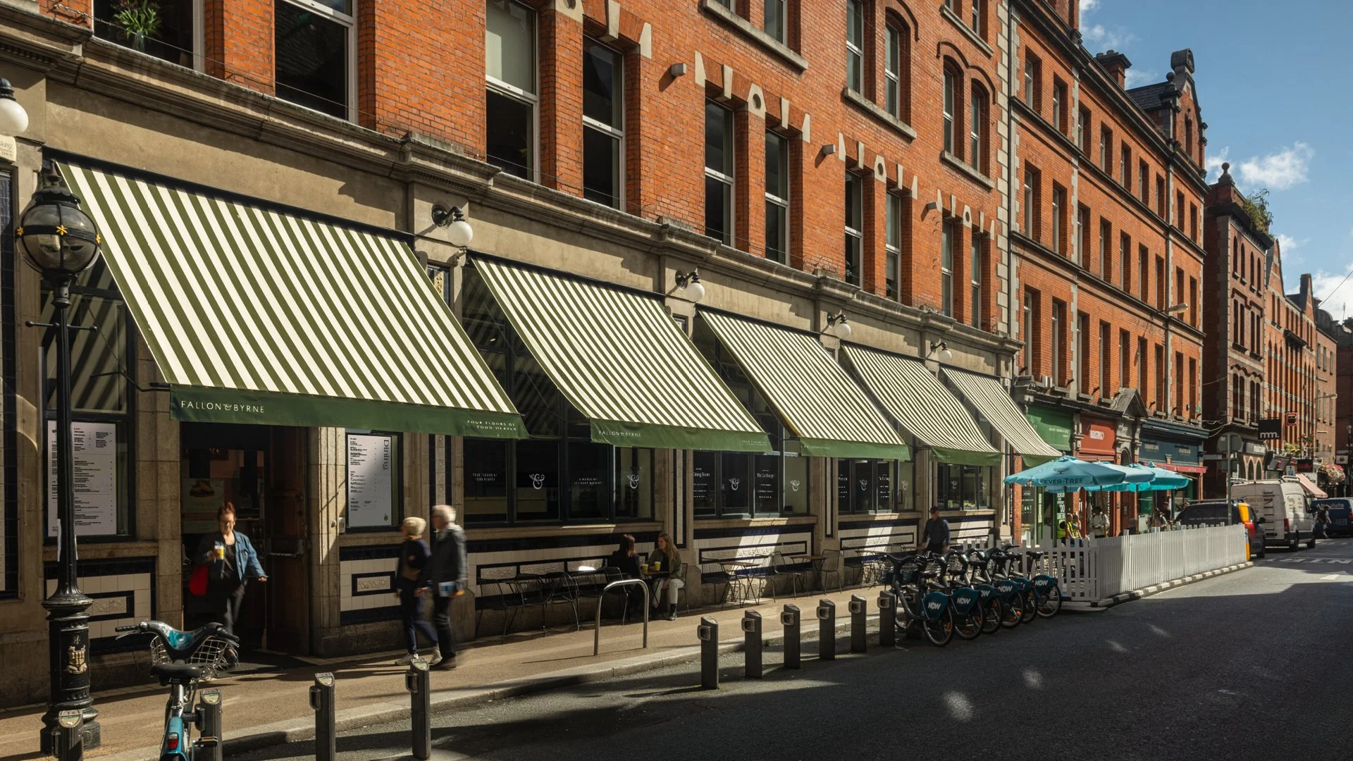
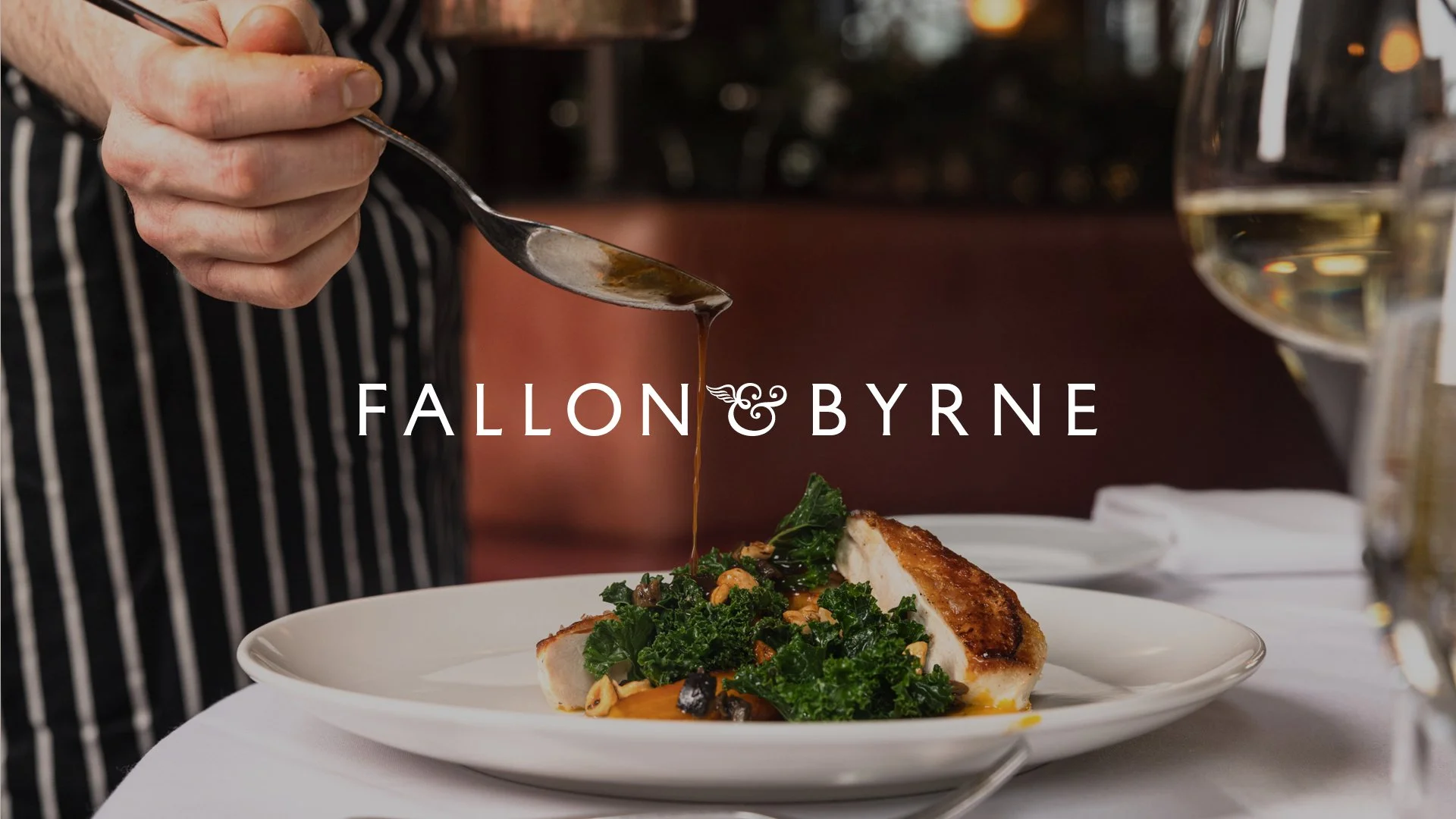
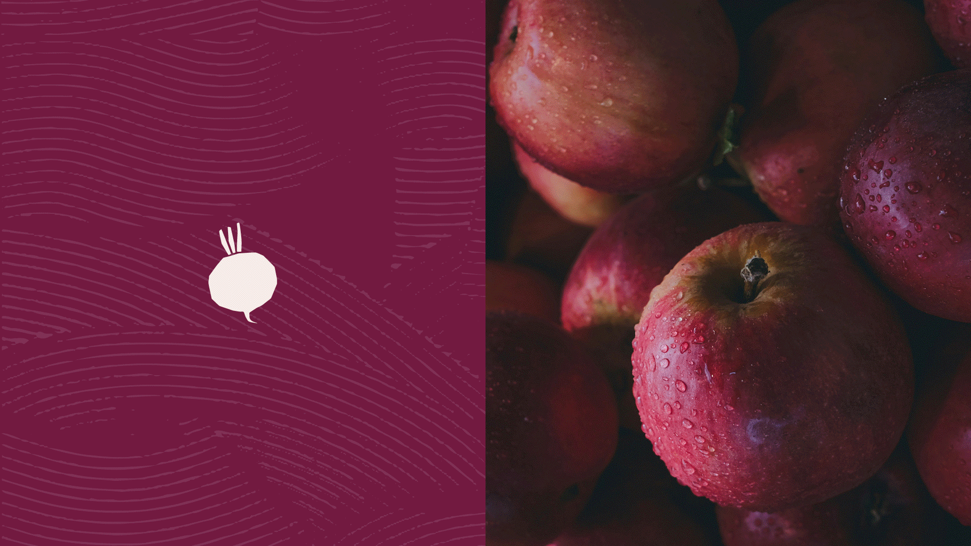
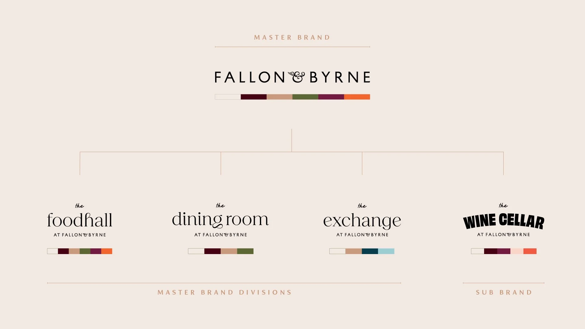
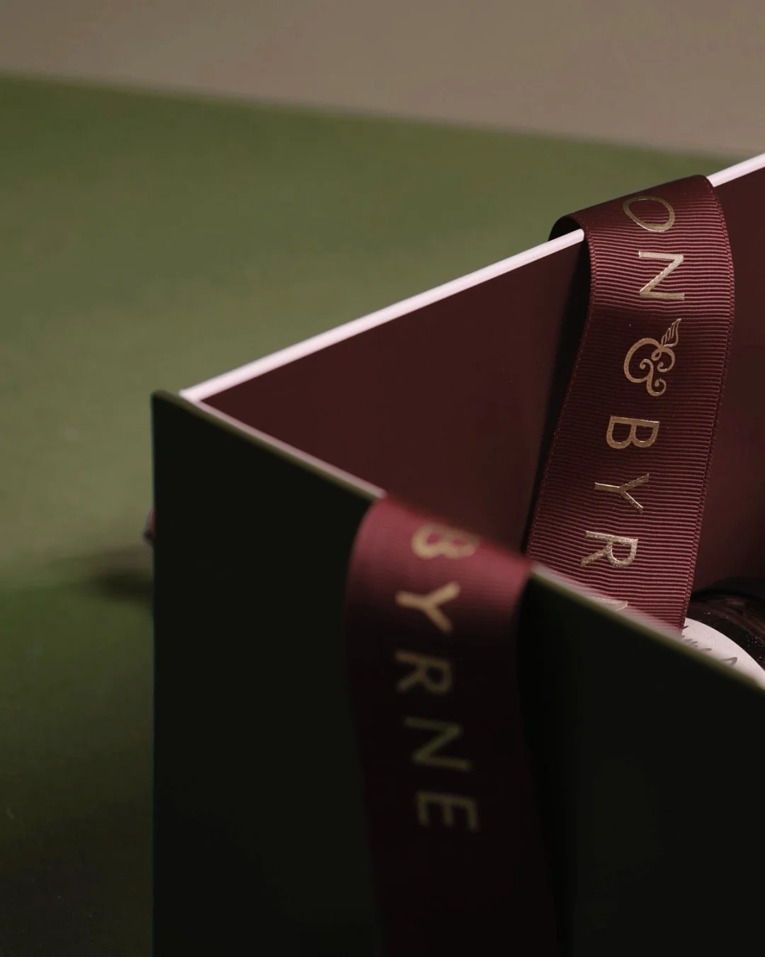
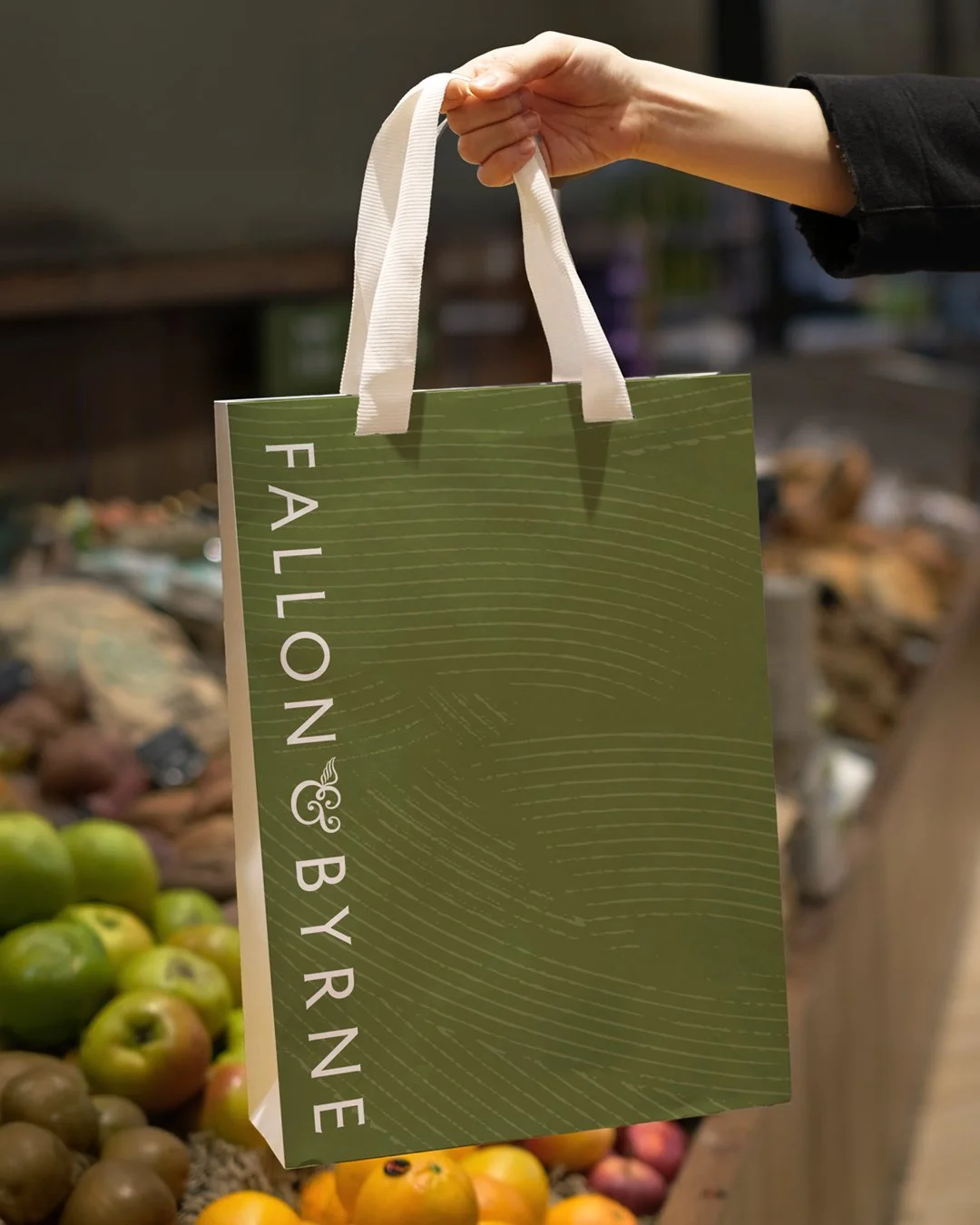
01. Fallon & Byrne
/
02. The Montenotte
/
03. Braeburn Cafe
/
04. Sullivan & Lambe
/
05. Silicon Grid
/
01. Fallon & Byrne / 02. The Montenotte / 03. Braeburn Cafe / 04. Sullivan & Lambe / 05. Silicon Grid /
01. Fallon & Byrne
Strategy / Architecture / Identity / Print / Wayfinding
Uniting four venues under one cohesive brand.
Project Type: Brand Refresh
Role: Senior Designer
Agency: BrandNew Creative
Sector: Hospitality
Photography: Sean Breithaupt, Fallon & Byrne In-House
Challenge
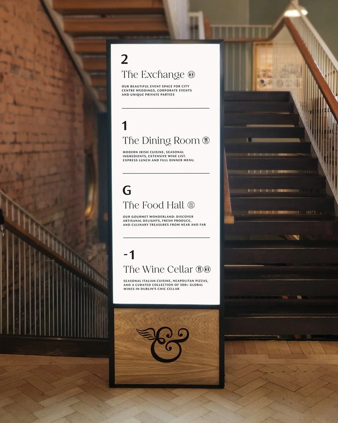
Fallon & Byrne’s four venues — Food Hall, Wine Cellar, Dining Room, and Event Space — all had distinct personalities but lacked a cohesive identity. Guests struggled to navigate the building, limiting discovery and engagement across the different spaces.
Solution
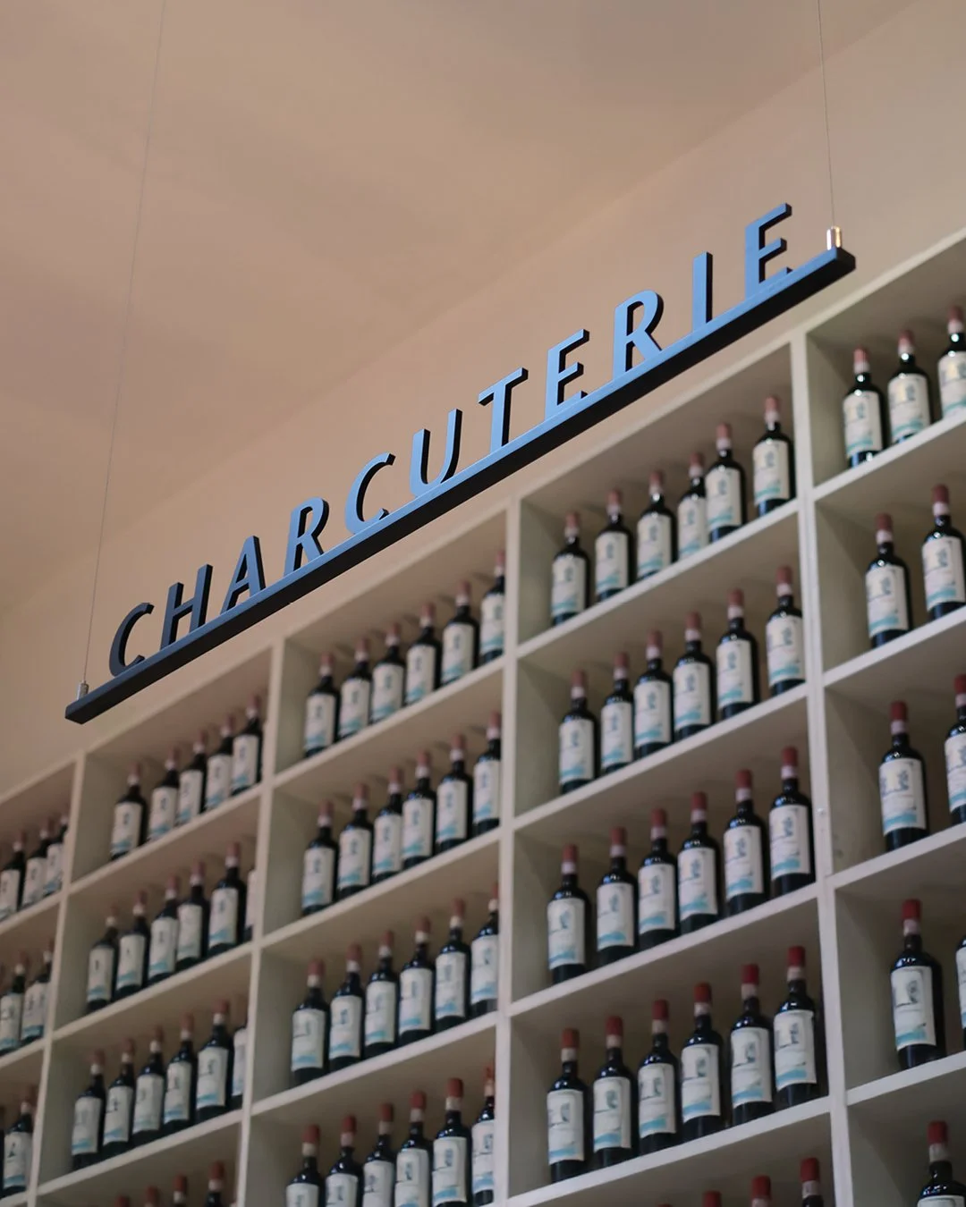
We created a unified brand system that seamlessly connects every venue. Experience logos, ingredient-led colour palettes, clear wayfinding, menus, brochure systems, and packaging work together to guide guests through the building, creating a premium, coherent journey for food lovers on every floor.
Re-imagining a Dublin food icon for its next chapter.
Structuring the brand for a unified, flexible system.
Bringing the brand to life across every touchpoint.
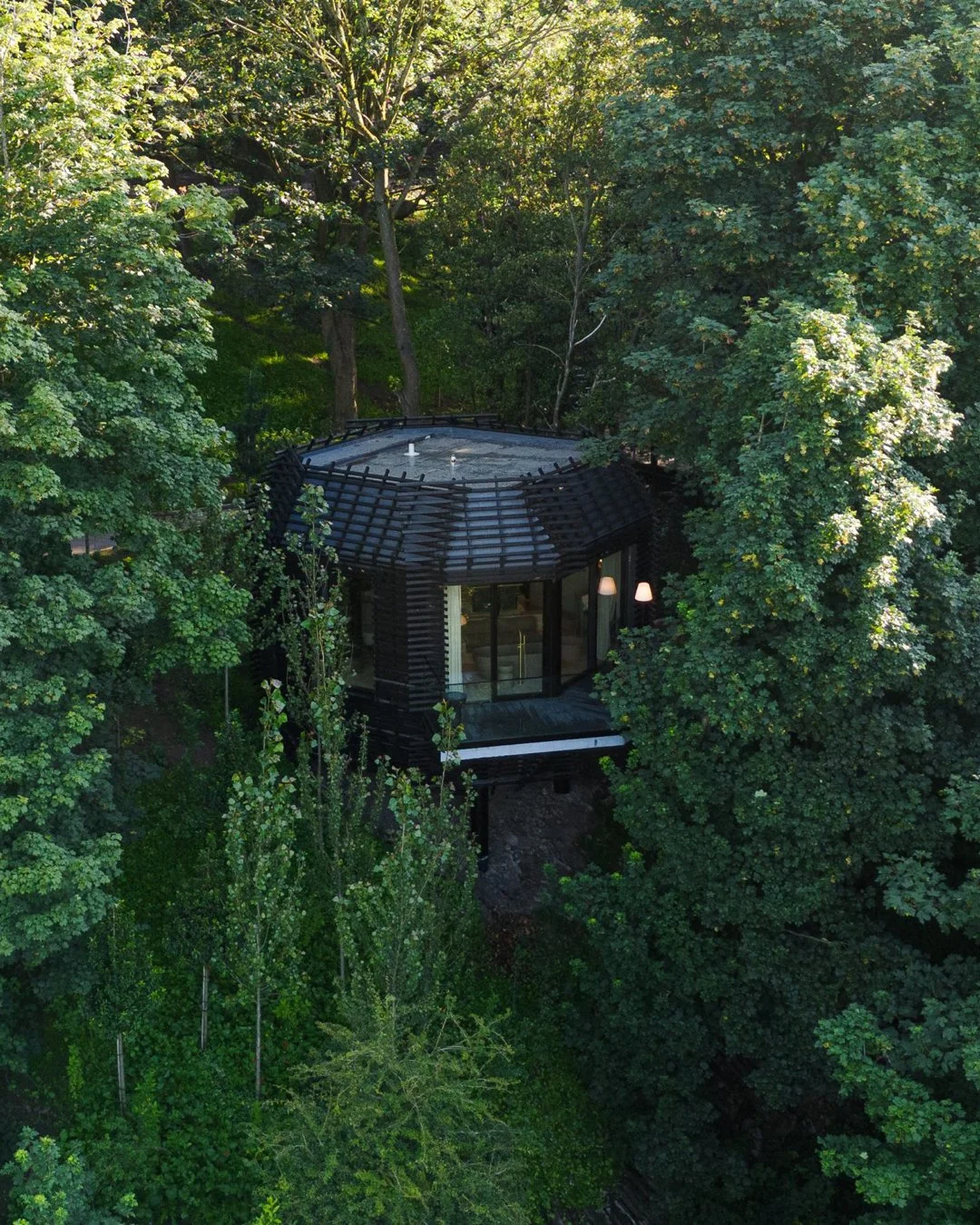
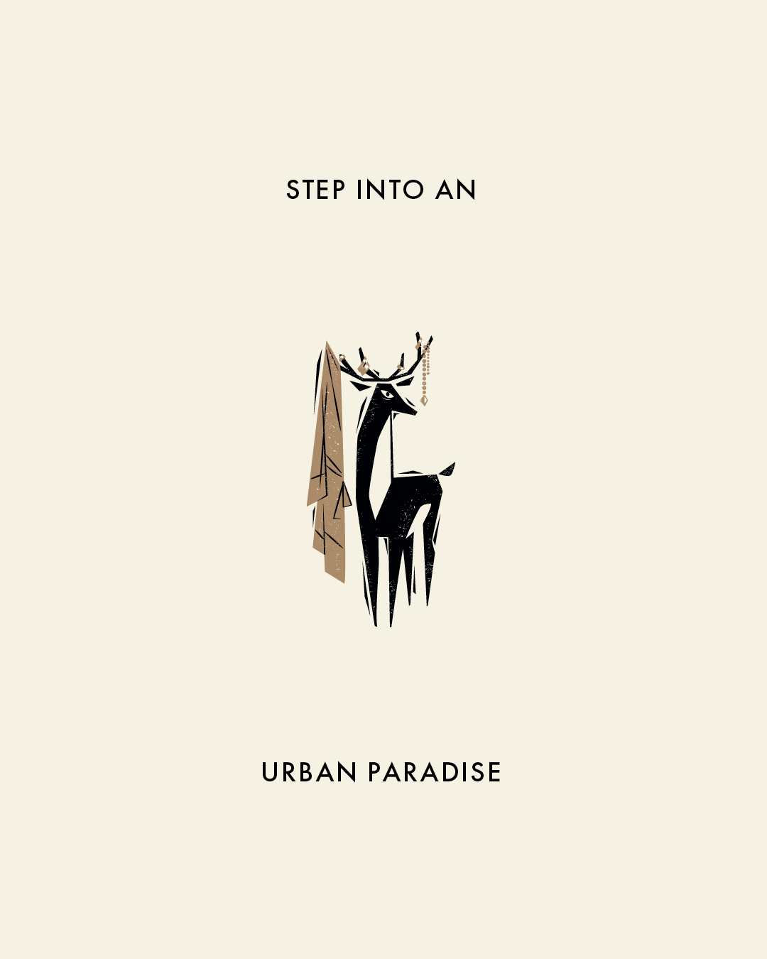
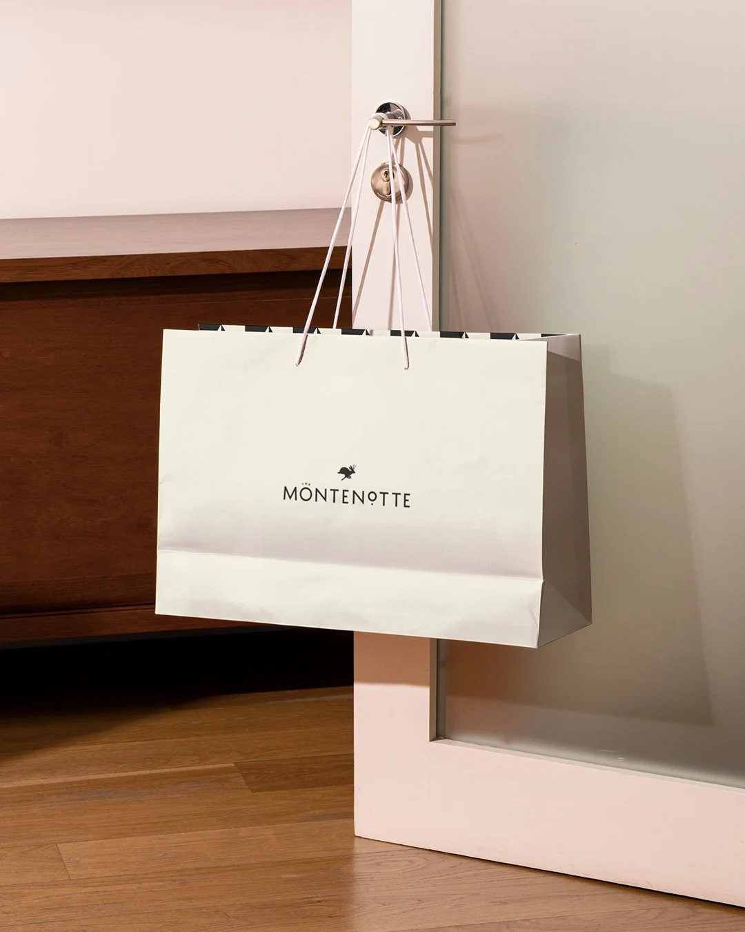
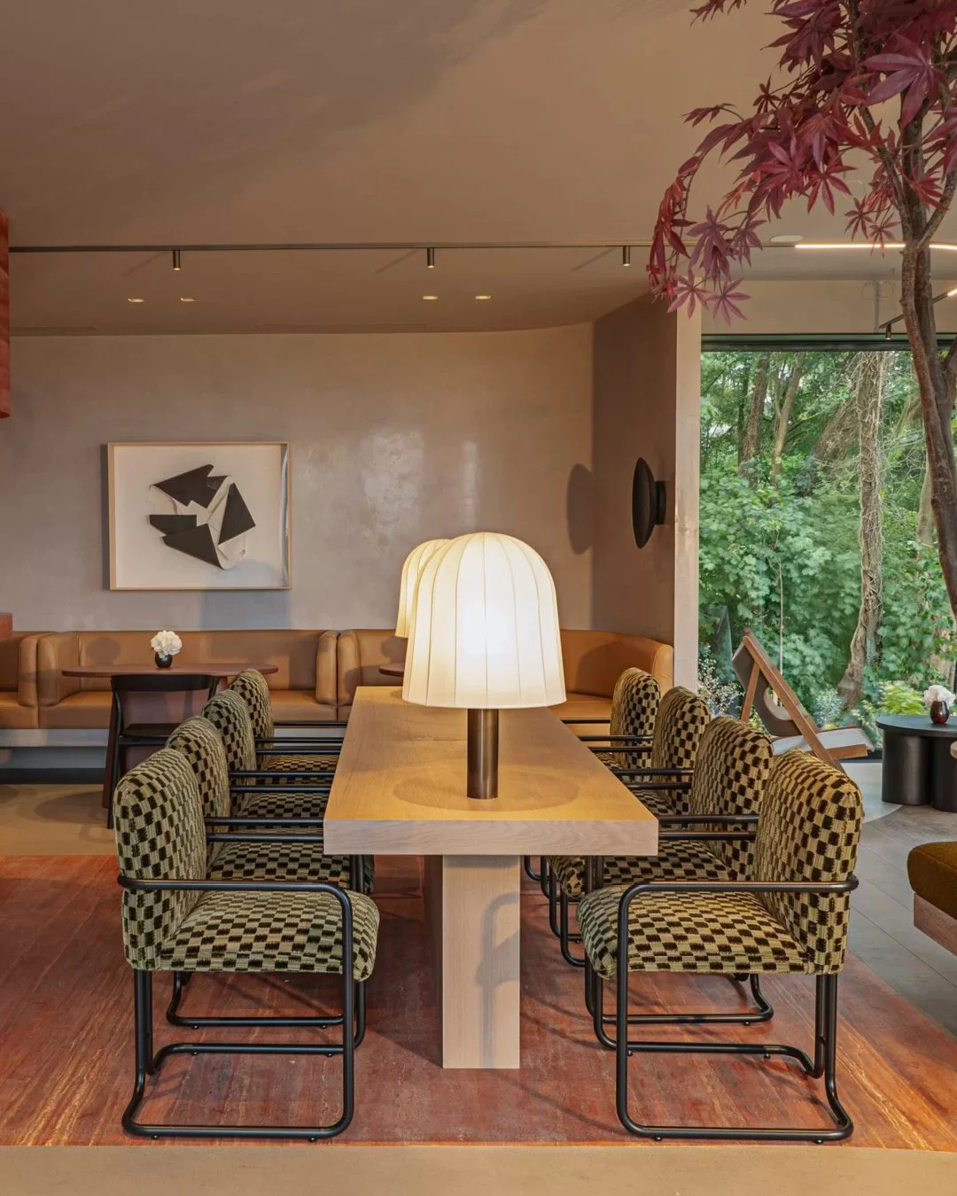
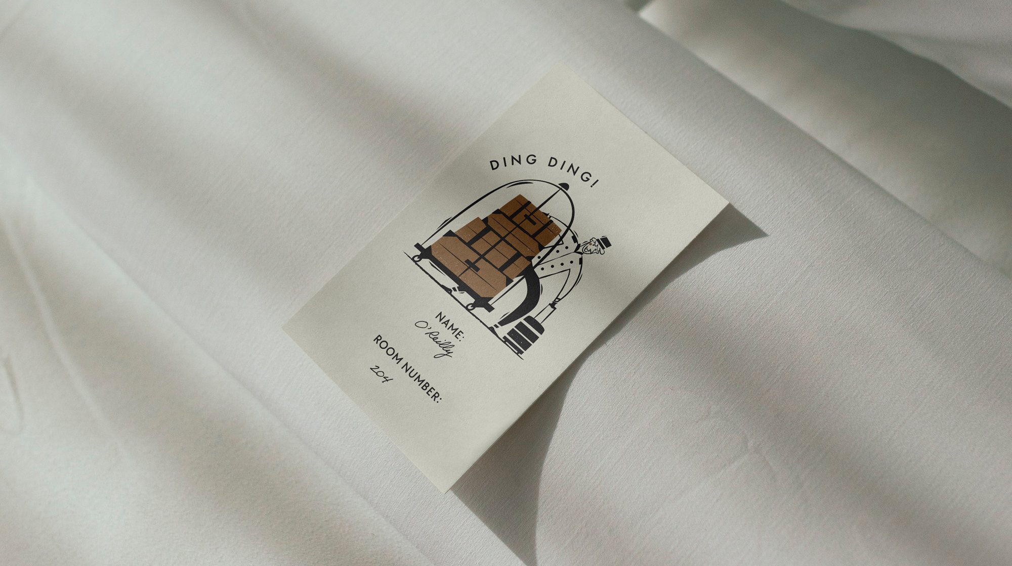
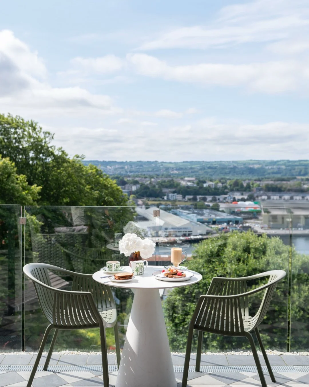
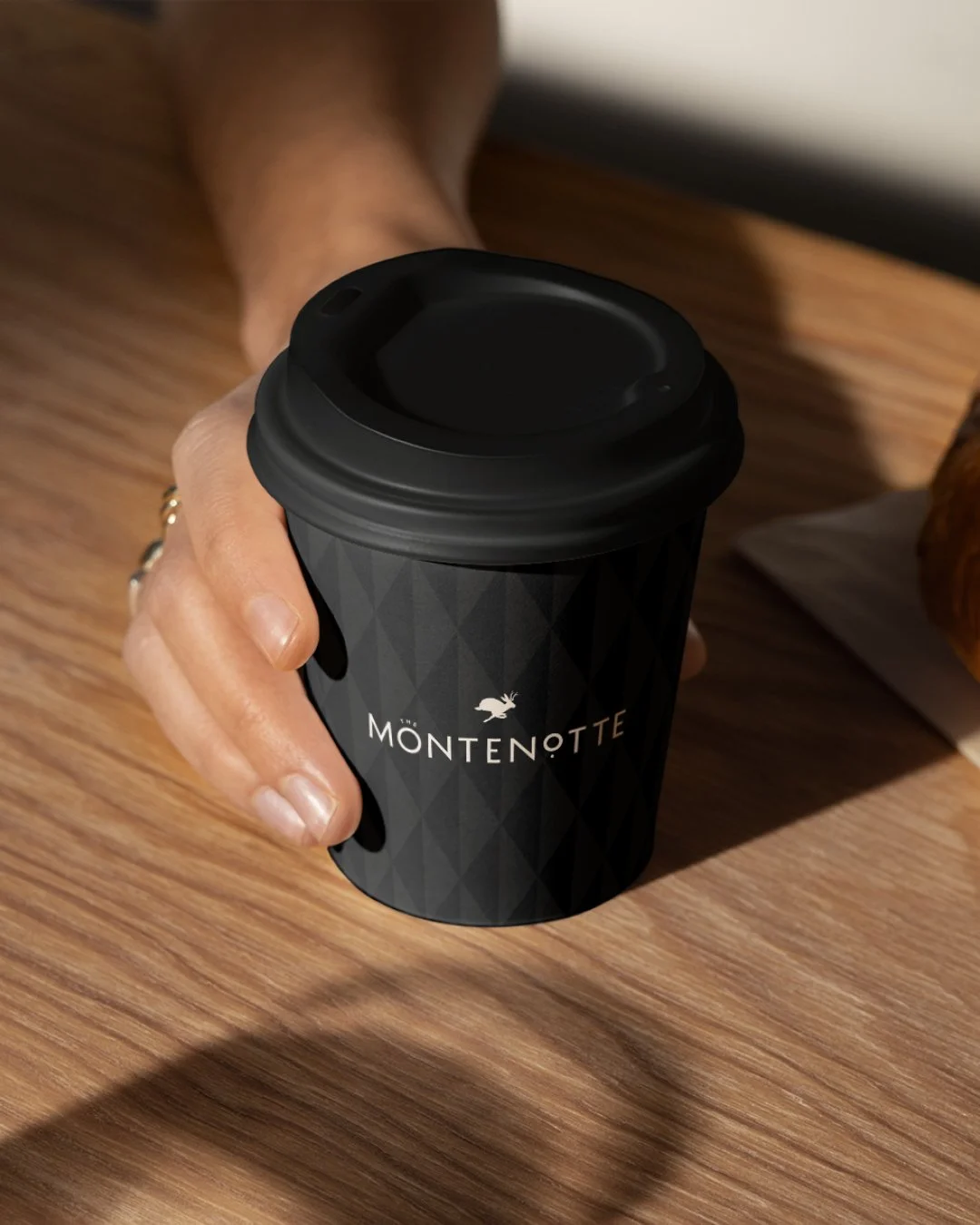
02. The Montenotte
Strategy / Architecture / Identity / Print / Wayfinding
Urban energy meets calm retreat.
Project Type: Brand Refresh
Role: Mid-weight Designer
Agency: Neworld
Sector: Hospitality
Illustrations: Peter Donnelly
Challenge
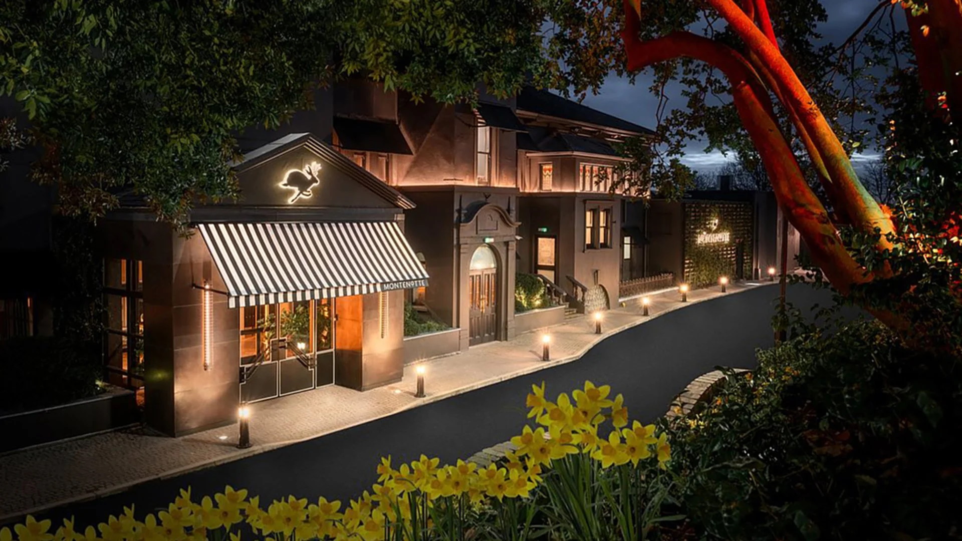
After major investment, The Montenotte needed an identity that better reflected its personality, elevated the brand from corporate to high-end leisure, unified its offerings, and strengthened recognition both locally and internationally.
Solution
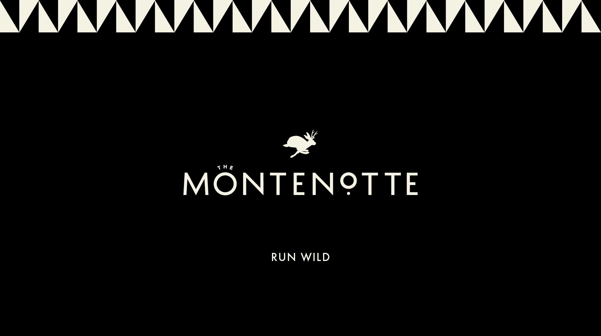
We reimagined The Montenotte as an Urban Paradise, blending city vibrancy with a secluded retreat. A new brand system was built from the ground up, including a mythical jackalope motif, neutral colour palette, and bespoke illustrations. Signage, print, and menu design extend the identity across touchpoints, creating a cohesive and elevated guest experience.
A mythical symbol for a magical escape.
Elevated hospitality with playful interruptions.
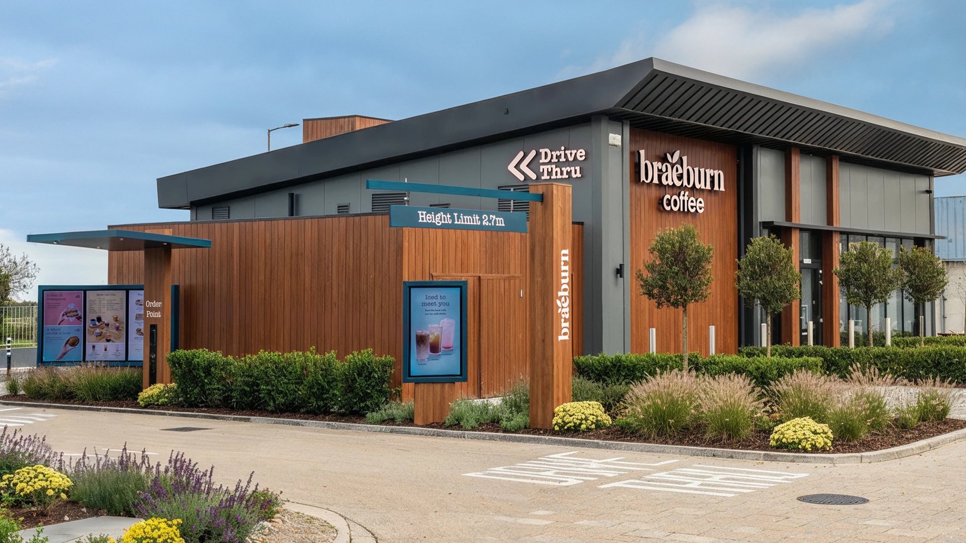
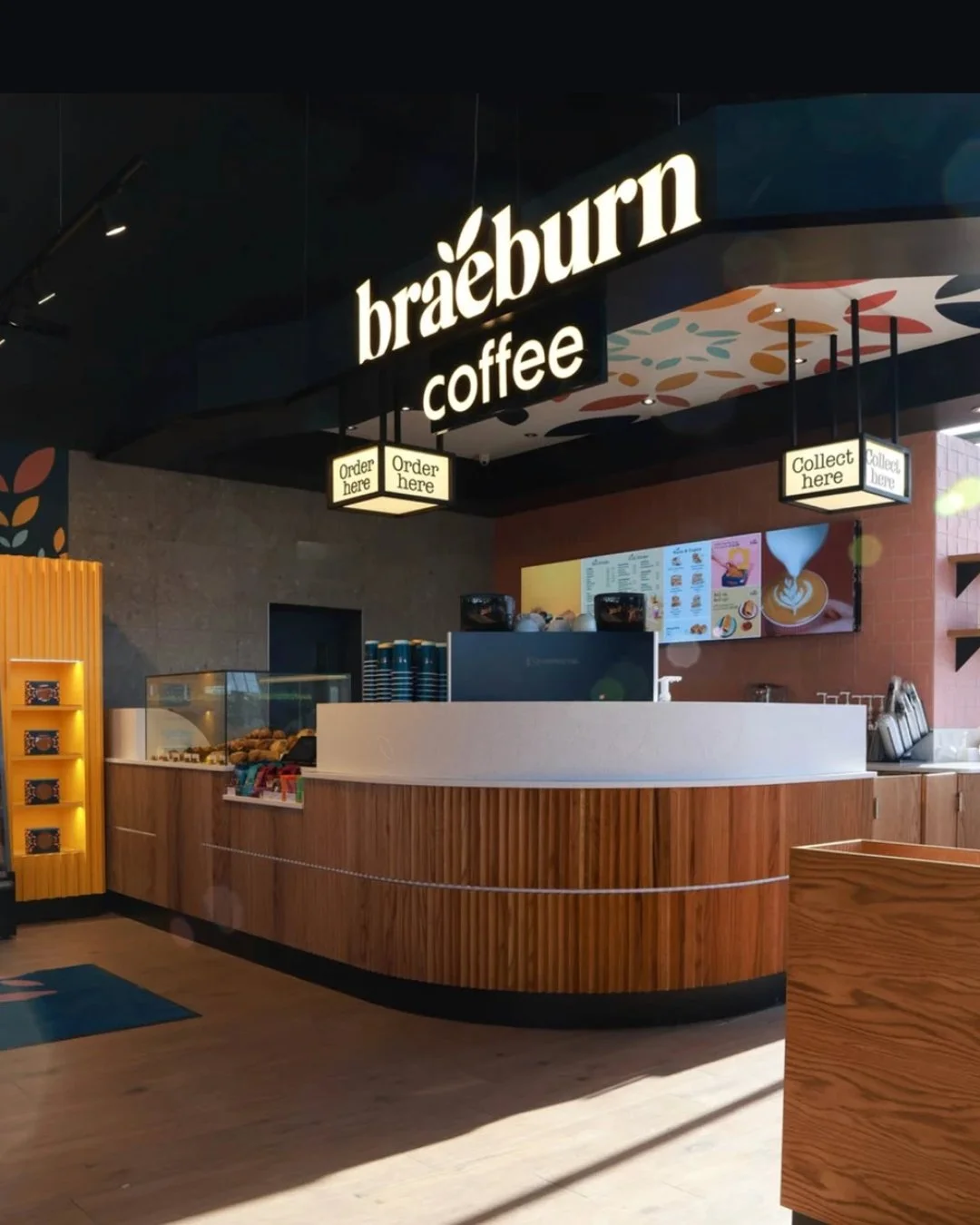
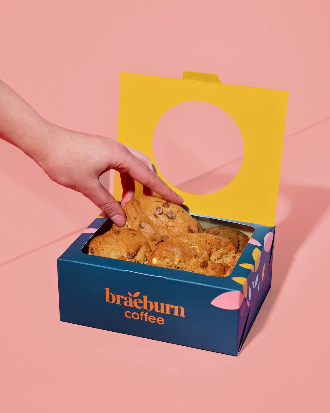
03. Braeburn Cafe
UX / Art Direction / Copywriting / Menu & Screen Design / Digital Interface
Guiding the drive-thru journey, moment by moment.
Project Type: Menu Screen Design
Role: Senior Designer
Agency: BrandNew Creative
Sector: Food & Beverage
Photography: Neil Hurley
Challenge
Applegreen’s Braeburn Coffee opened their Rathcoole drive-thru with a need for dynamic, clear menu screens that matched their premium roadside positioning. Content had to adapt across dayparts, serve the needs of a time-pressed customer, and reflect the brand’s bright, playful personality.
Solution
We designed the screens end-to-end including UX, art direction, layout, and interface design. Each menu was crafted for specific times of day, ensuring the right products and messaging met the right customer at the right moment. The result is a premium, intuitive experience that enhances the drive-thru journey and maintains consistency across locations. This system has since been rolled out to new sites, supporting Braeburn’s expansion as Ireland’s first premium roadside drive-thru coffee brand.
Content crafted for every customer, every moment.
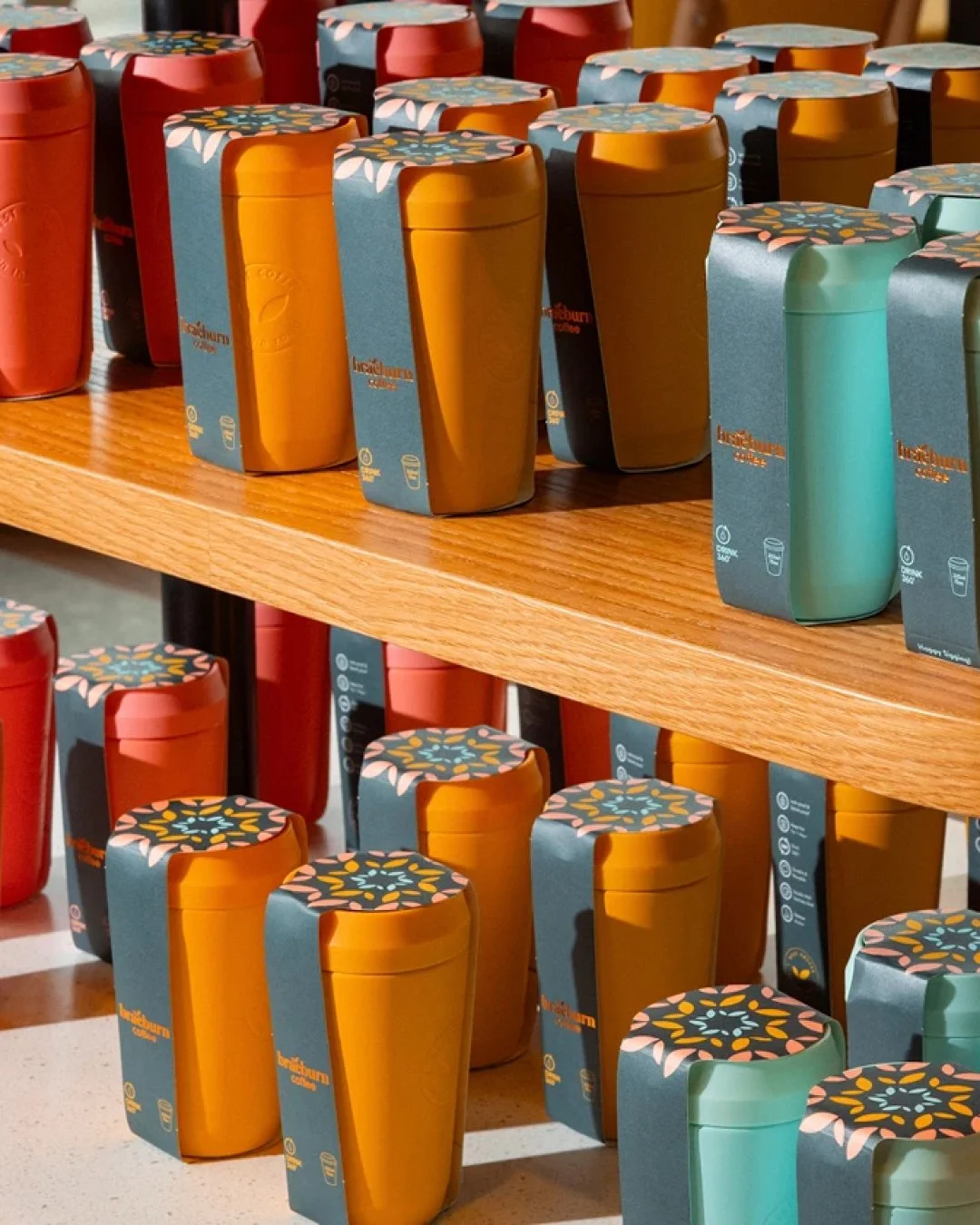

Bright, fun, and full of character.
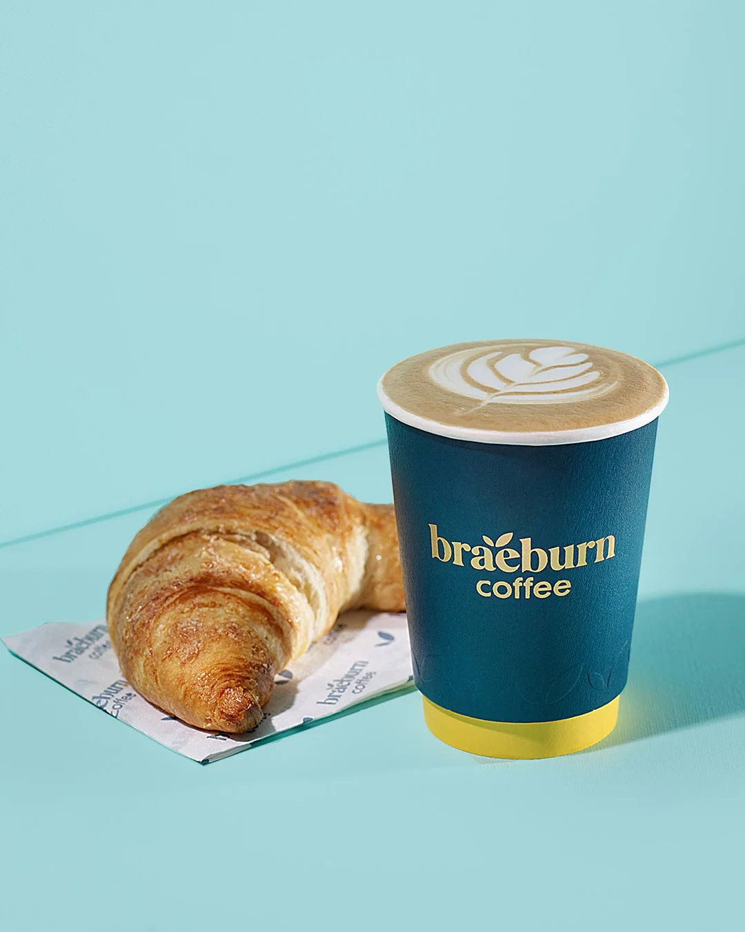
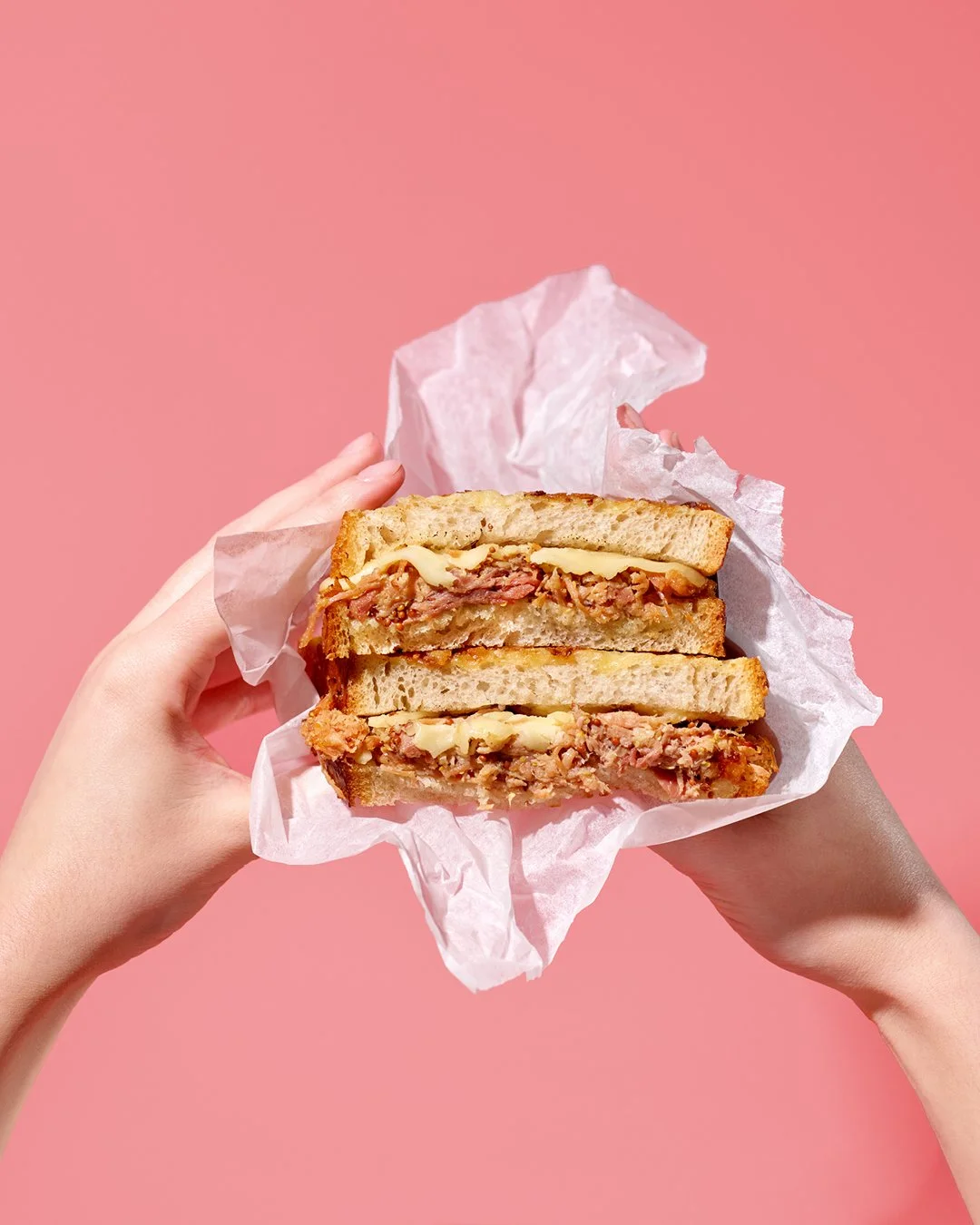

Every choice made clear at a glance.
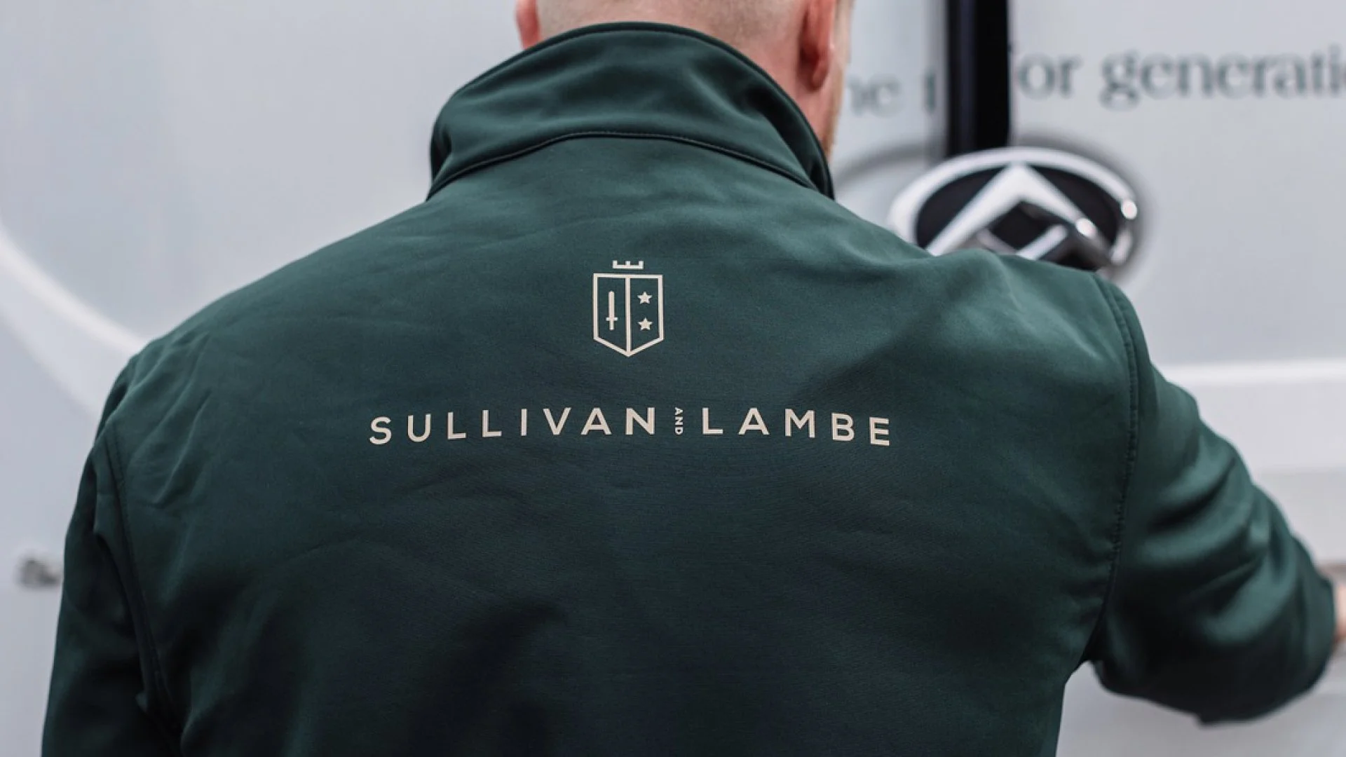
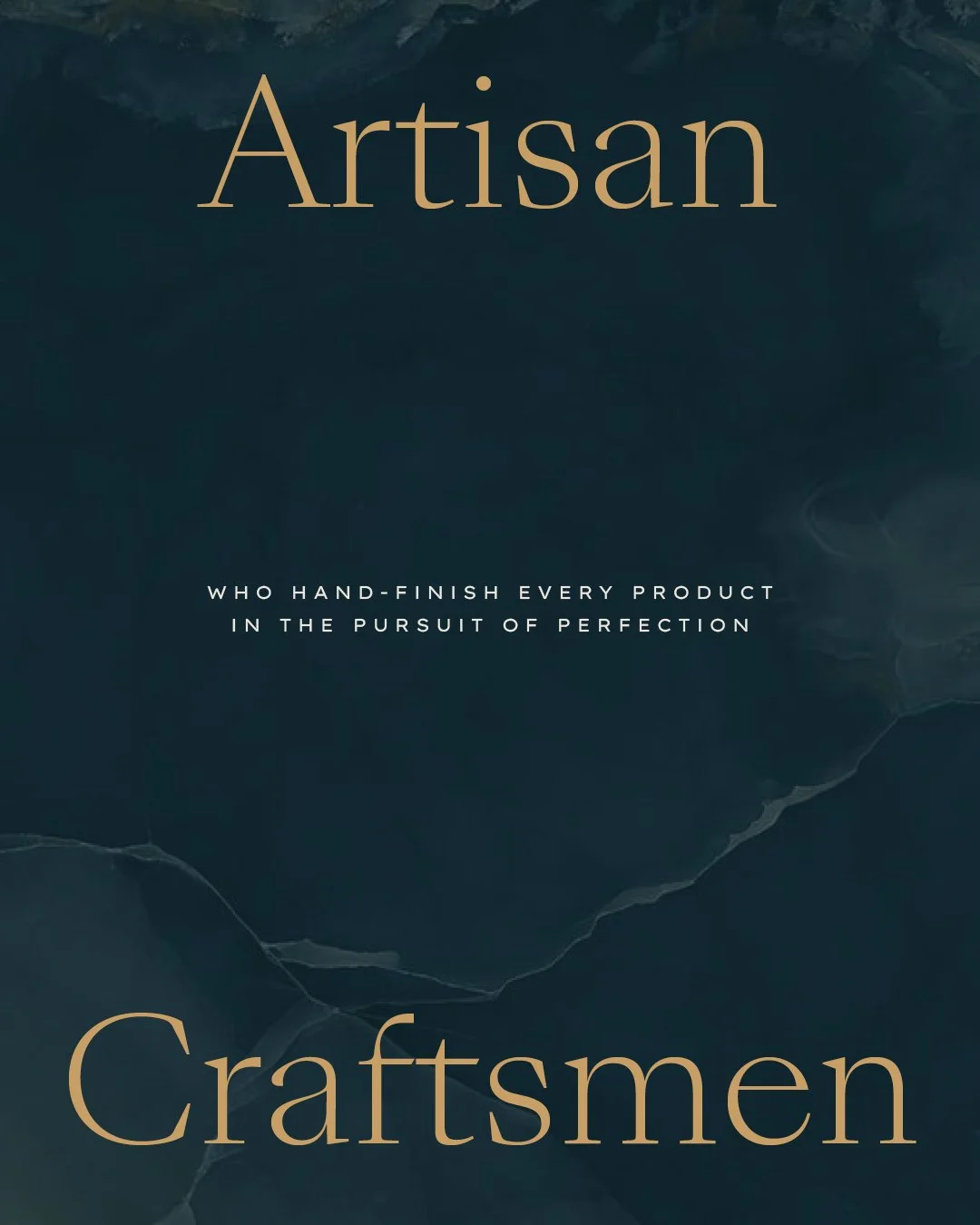
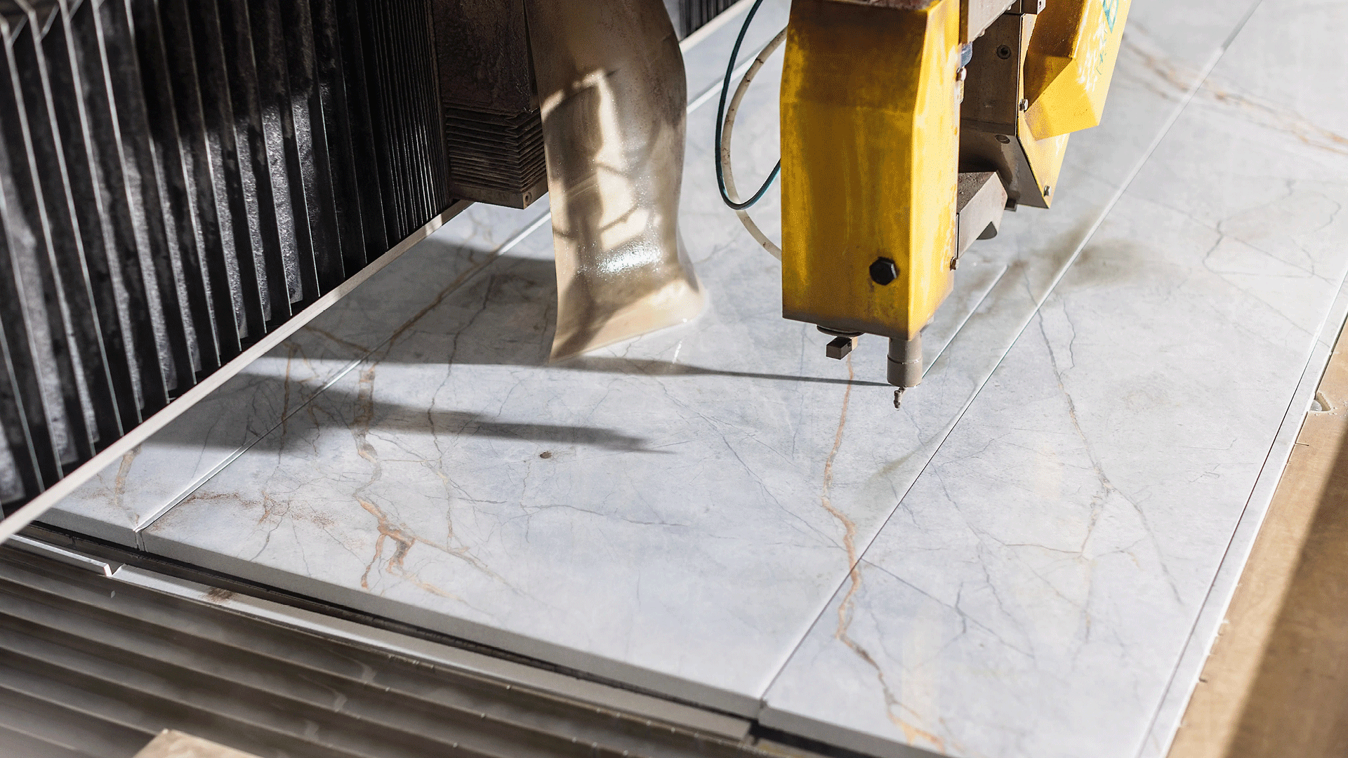
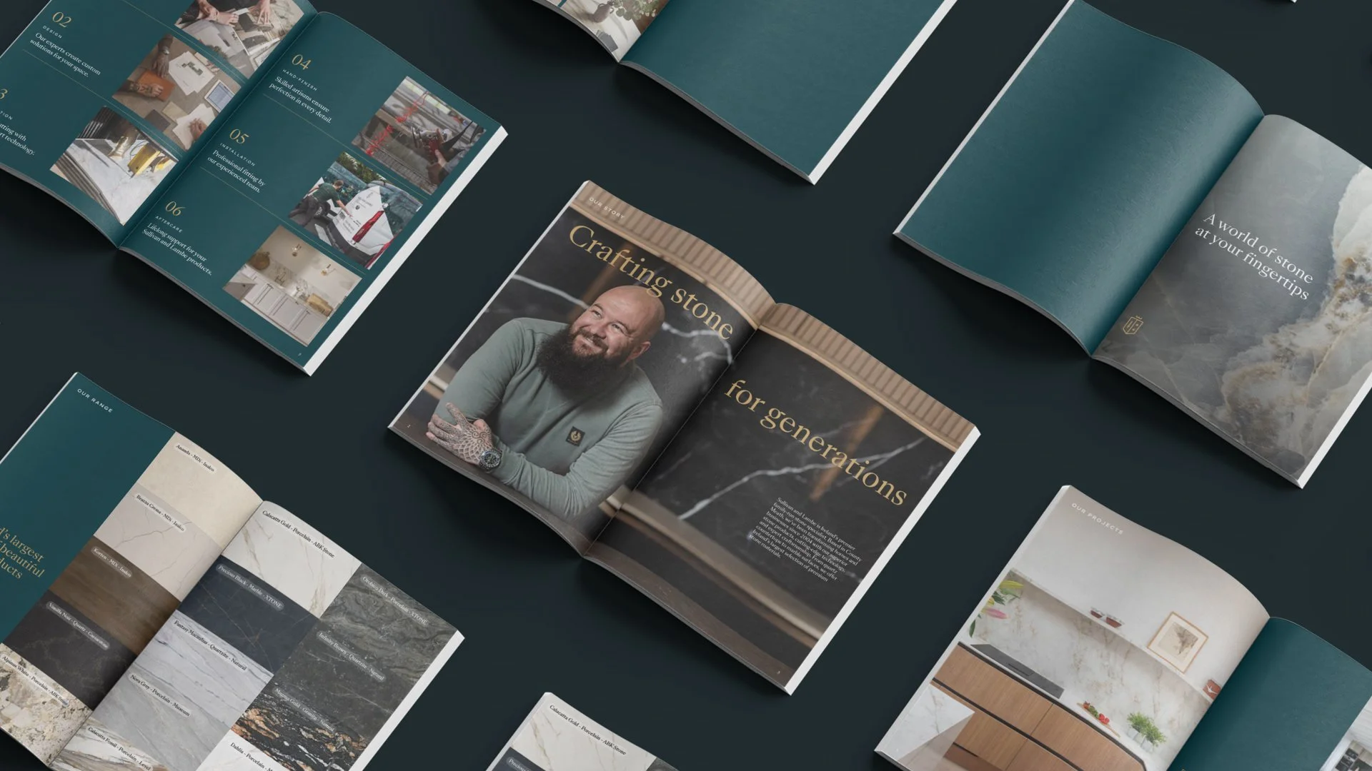
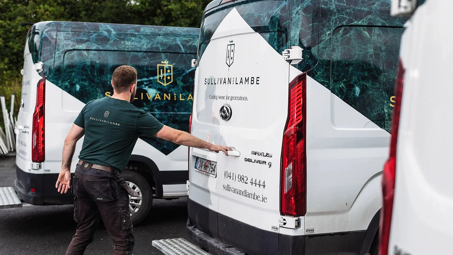
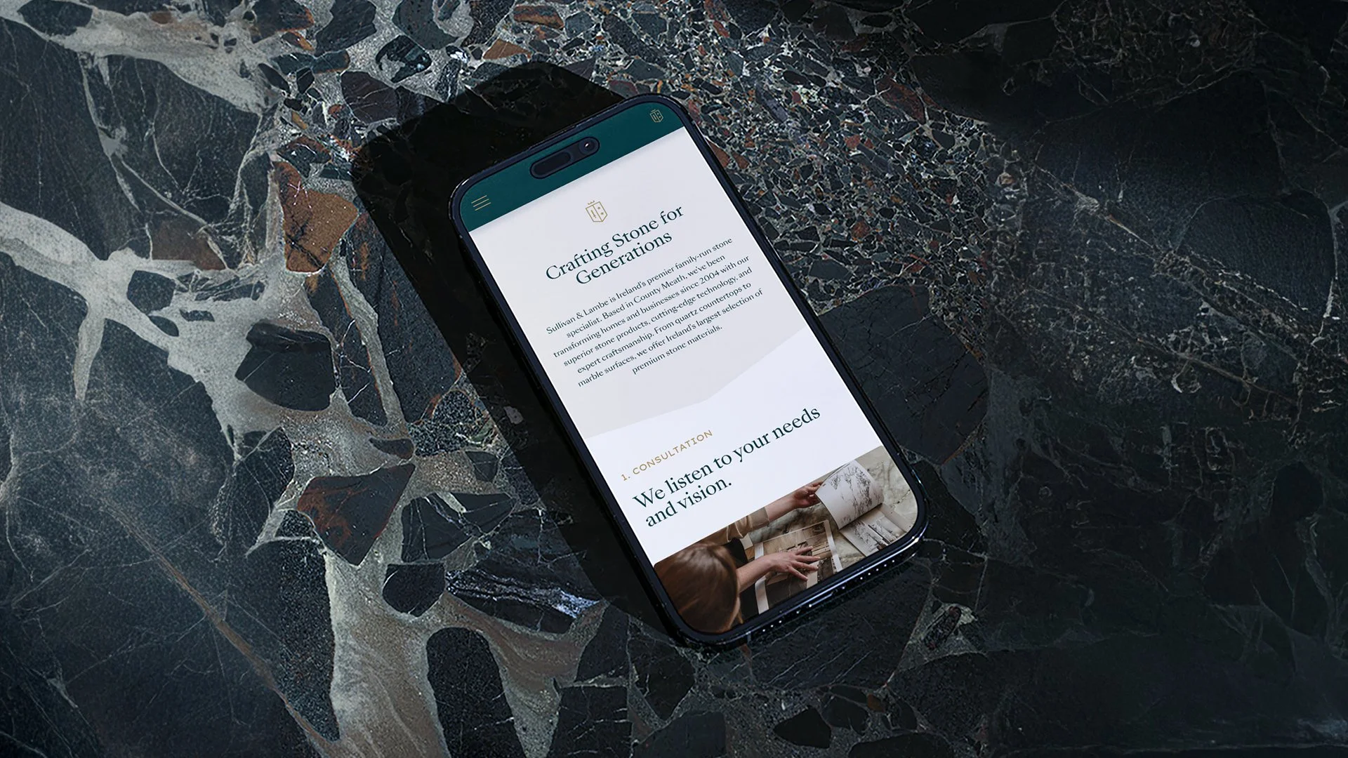
04. Sullivan & Lambe
Strategy / Naming / Identity / Print / Wayfinding / Art Direction
Redefining craftsmanship for a modern era.
Project Type: Rebrand
Role: Senior Designer
Agency: BrandNew Creative
Sector: Lifestyle / Construction
Photography: Al Higgins
Challenge
Previously known as Granite Tops, the company had outgrown an identity that no longer represented its scale, expertise, or ambition. They needed a brand that communicated precision, craftsmanship, and a more design-led approach.
Solution
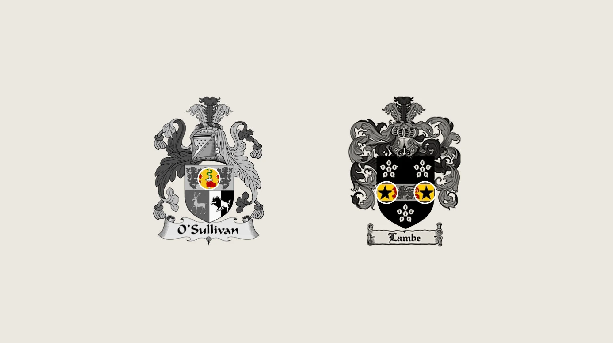
We renamed the business Sullivan & Lambe, honouring its founders while positioning the brand for a premium, contemporary market. The logo is a crest with elements drawn from the O’Sullivan and Lambe family crests. We took advantage of the company’s large form scanner, incorporating textures of granite blocks throughout the identity. Refined typography, tactile materials, and understated colour combine to express a legacy of quality and meticulous attention to detail.
An identity rooted in history.
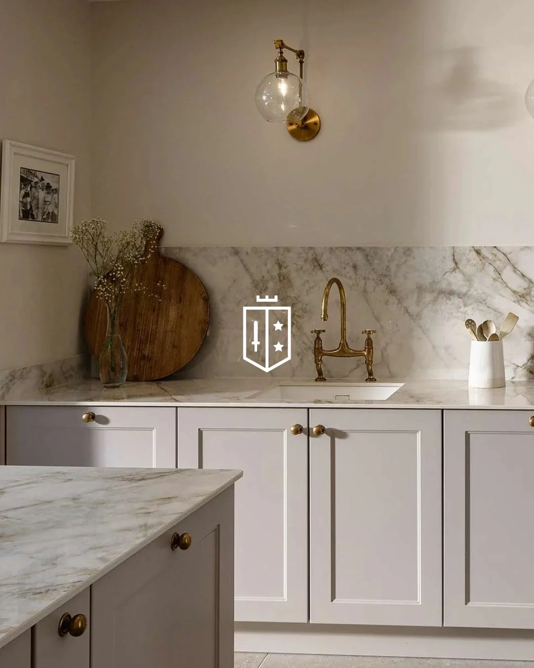
Every detail, every stage, carefully recorded.
Bringing the brand to life.
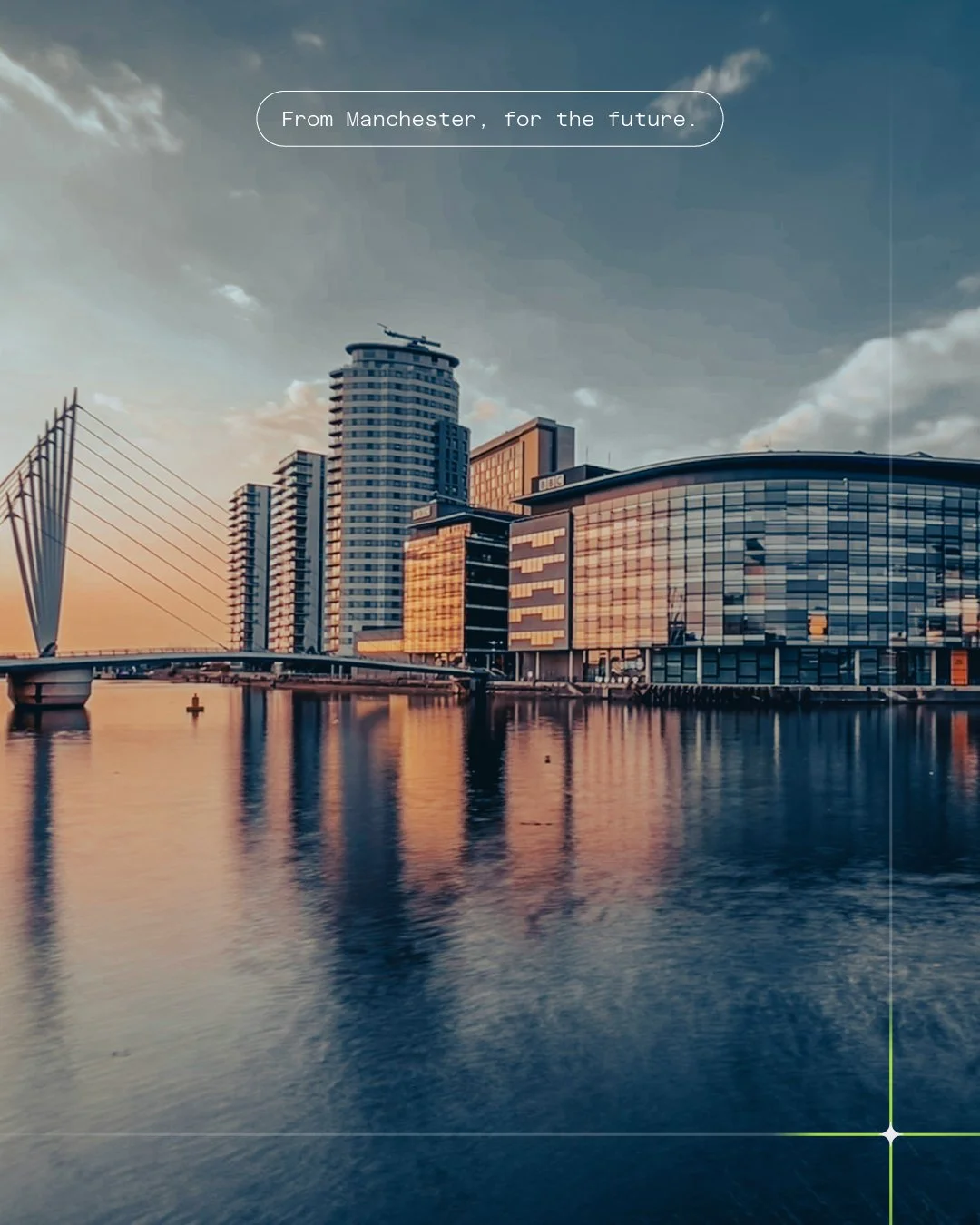
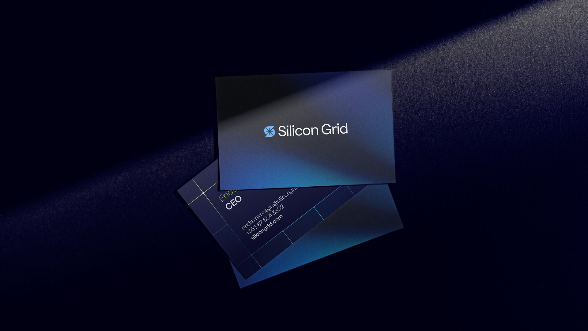
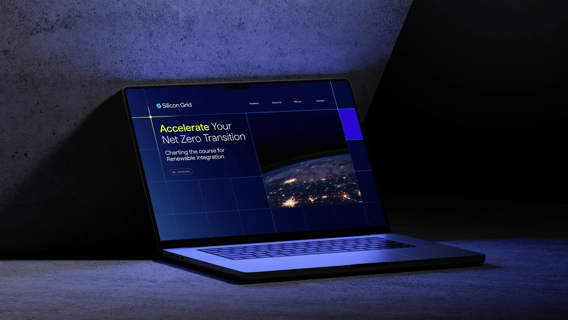
05. Silicon Grid
Strategy / Identity / Messaging / Iconography / Digital Guidelines
Guiding the way in energy innovation.
Project Type: Brand Creation
Role: Senior Designer
Agency: BrandNew Creative
Sector: Energy / Technology
Challenge
Silicon Grid needed a brand that positioned them as a trusted guide in an evolving energy landscape, communicating their technical expertise, sustainability focus, and Manchester-born spirit of innovation.
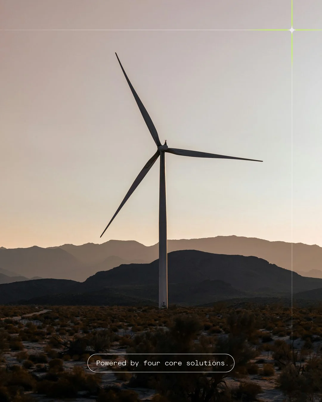
Solution
We created a cohesive brand system covering identity, messaging, and digital guidelines. Typography, colour, iconography, and a clear service structure work together to deliver clarity, precision, and confidence. The brand positions Silicon Grid as a forward-thinking energy partner rooted in Manchester’s legacy of technological innovation.


Icons that make complex services clear and intuitive.
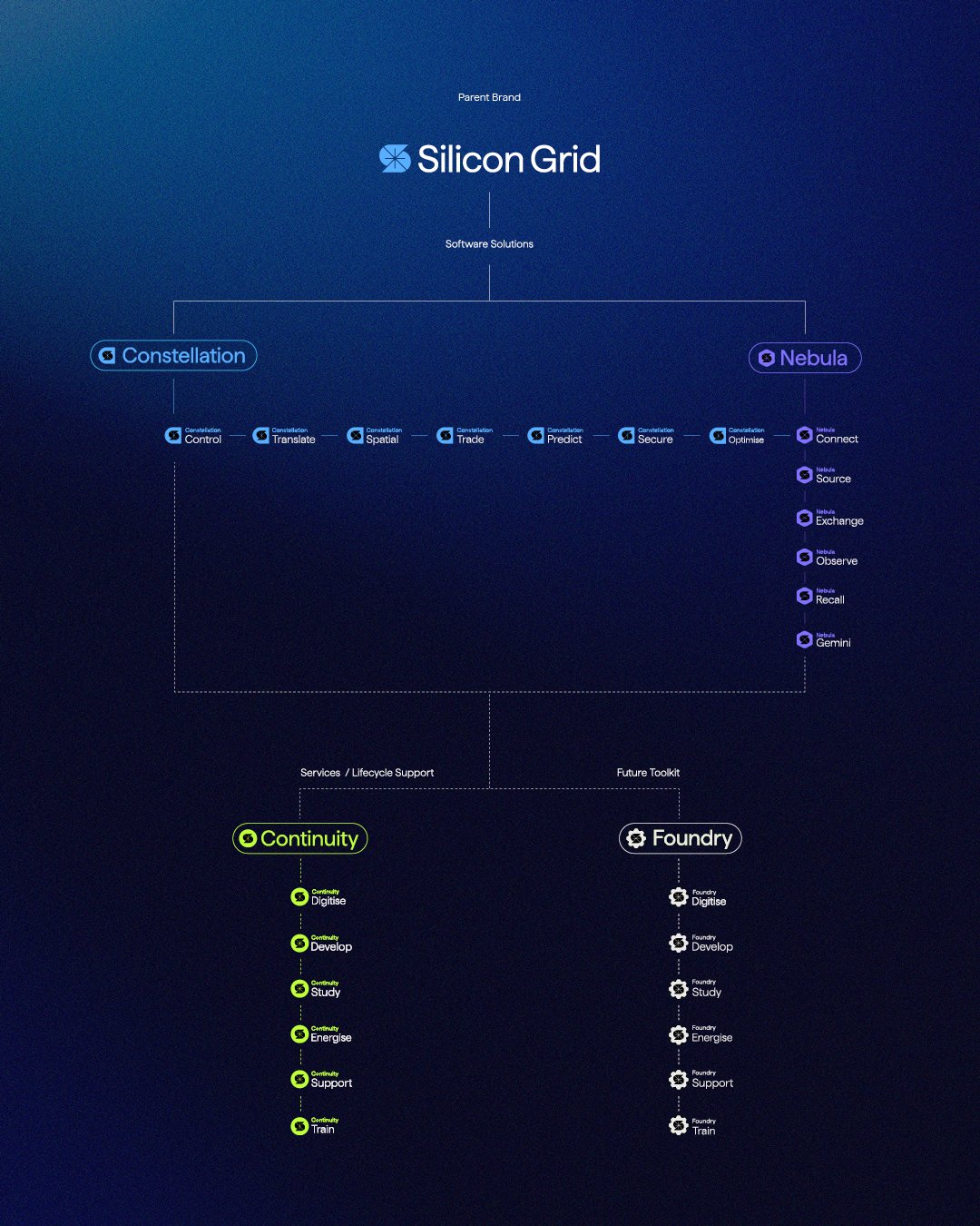
Design that makes intricate systems approachable.
Let’s talk — hello@ailbhediskin.com↗